Another New Thing: Phonespiration by Zan Barnett

Here’s just a bunch of pictures I’ve collected over the past little while involving awesome design or anything that gave me a thought. I’m gonna try to take more photos and do this mucho more often:) Scope!

First zone is about sweet type I've found:

I found some sexy-old Bookman in the wild at the thrift-store like a month ago.

I found some sexy-old Bookman in the wild at the thrift-store like a month ago.

Super-old museum find. OG Hobo, very wacky and very cool.

Super-old museum find. OG Hobo, very wacky and very cool.

Bookstore find. So dope. Bought it for six bucks:)

Bookstore find. So dope. Bought it for six bucks:)

Inside gets even better!

Inside gets even better!

Old cowboy town + huge wall paintings = DOPE.

Old cowboy town + huge wall paintings = DOPE.

See what I mean:)

See what I mean:)

Maybe the coolest hat I’ve ever owned. Bears and 1994 crazy type is PERFECT.

Maybe the coolest hat I’ve ever owned. Bears and 1994 crazy type is PERFECT.

Classic tourist picture of the amazing Austin Power Plant.

Classic tourist picture of the amazing Austin Power Plant.

Next zone is for wacky type: This week’s theme is vans (maintenance, not shoes).

Wacky Van #1: I call this ‘replAce’.

Wacky Van #1: I call this ‘replAce’.

Wacky Van #2: This one is ‘BOAnnn’.

Wacky Van #2: This one is ‘BOAnnn’.

Final zone is layout, logos, and branding:)

I bought this book 100% for the beautiful cover, and 20% cause Gucci Mane is tight.

I bought this book 100% for the beautiful cover, and 20% cause Gucci Mane is tight.

VERY dope: found in Cedar City, UT. Original AT&T bell logo. Changed to the early globe mark in 1984. Damn this guy might even be one of the last living survivors.

VERY dope: found in Cedar City, UT. Original AT&T bell logo. Changed to the early globe mark in 1984. Damn this guy might even be one of the last living survivors.

This logo is SO brilliant, but only if you know. . .

This logo is SO brilliant, but only if you know. . .

…that it’s for the building on the right. Look up One Eleven Congress in Austin, TX.

…that it’s for the building on the right. Look up One Eleven Congress in Austin, TX.

And that’s it until the next one! Thanks mucho for checking it out:)

Ctrl+Z: These Ads by Zan Barnett

ZanBarnett-Design-Kerning.jpg

This ridiculous kerning has to be intentional right? Right?! But if so, why?

Or it’s unintentional and was designed by a seal? Some other animal that lacks opposable thumbs? Shit, I don’t know what to think, but this type treatment can get Ctrl-Z’d for sure.

All typographically-challenged posters can be seen here.

Ctrl+S: Dazzle by Zan Barnett

Check out this amazing project, and even more amazing concept in general.

Image Credit: Pentagram

Image Credit: Pentagram

Domenic Lippa (the best), and his team created this brilliant exhibition installation for The Creative Studio at the V&A based on the visual language of ‘Dazzle’ (click that link for sure).

Dazzle camouflage, painted onto the surface of ships, was an experimental technique pioneered by British artist Norman Wilkinson during the First World War, drawing on avant-garde artistic movements such as Cubism and Vorticism, as well as animal camouflage. These bewildering shapes and angles were designed to skew an enemy’s perception and make it more difficult to determine a ship’s position, direction or speed, rather than to conceal.

When a super-interesting concept, historical significance, black & white palette, typography, and patterns fuse together, it’s hard not to love a project like this.

P.S. sidenote: ‘dazzle’ is a funny word

New Idea, Better Idea: Ctrl+Z by Zan Barnett

180822-CtrlZ.jpg

Alright, So I hit an epiphany last night. . . 

Long(ish)-form writing is hard and can be very much a daunting task. I feel like I need a ton of words, some well-formed thoughts, a beginning/middle/end, etc. And most of the time I have an idea of something I want to write about, I usually abandon it after I start because it starts to feel like I'm writing a paper (Lots of unpublished drafts).

So I had a better idea.

My new posts are gonna be more rapid-fire takes on designs I see/like/love/hate/whatever. They could be things I've found in nature, or large-scale redesigns or anything really. They're gonna be simply divided into two categories: Ctrl+Z and Ctrl+S. Basically undo it vs save it, dig it vs. not digging it. 

Hopefully, this lets me write more/better/quicker with less pressure to actually be a solid writer while still throwing my thoughts out into the ether. 


Here's an example: 

Ctrl+Z: New Library of Congress logo, Designed by Pentagram (Paula Scher)

CtrlZ-Library-BeforeAfter.png

Pentagram doing Pentagram things again, which on it's own is not a bad thing at all. Paula Scher (fellow Tyler School of Art alum, hell yeah) is fuckin' inspirational and her work is never not good. But the bummer about this update is the loss of the previous mark created by Ivan Chermayeff (RIP in Peace) and Tom Geismar in 2010. On it's own it's insane that the previous mark is only from 2010, as it has that CGH timeless-as-shit quality about it that is simply beautiful.

If you don't know CGH's work, I'm not sure what to tell you, but it can be argued that no agency has created more brilliant and long-lasting marks over the years. So I guess I'm gonna CTRL-Z this new shit because I'm sad about throwing out the old mark, and I think the expected Pentagram solution (see Public Theater or EFF identities to see what I mean by 'expected'), while bold, doesn't validly replace the gravitas of the previous logo. 

That's my 2-cents: Ctrl-Z the new Library of Congress logo. 

Mystery: The Staples Logo by Zan Barnett

HigherEd-ZanBarnett-Staples.jpg

Yo, here's a little story:

I'm not 100% sure, but I'm fairly certain that my initial interest, exploration, and passion for design was spawned by one thing: the Staples logo. 

If you live in the United States and have ever needed office supplies, the Staples logo should be somewhat familiar. Founded in Massachusetts in 1985 as the first office supply superstore the Staples logo has remained (relatively) consistent and brilliant since it's inception. 

HigherEd-ZanBarnett-Staples1.jpg

As I'm sure designers know: yeah, the 'L' is a bent staple, but to a six-year-old me, this was an epiphany. As far as I can pinpoint, noticing this detail was the point at which I realized that concept, language, and visual form can come together to make a powerful statement. It was mind-blowing and beautiful and kicked off a passion for design that is going strong 22 years later.

Here is where the mystery comes in: who the fuck designed it?

I'm pretty good at research and once wrote a 25-page paper about a statue, so I'm decently proficient when it comes to scouring the internet for information, but I cannot find a damn thing about who originally conceived and designed the original staple-as-the-L version that endures today. I would assume in-house but there has to be a name out there somewhere right? So basically I'm reaching out (I know no one probably sees this, but whatever) to see if anyone can provide insight into the brilliant mind who bent that first 'L'.

I owe them a beer. 

Amazing Human: Andy Pitts by Zan Barnett

HigherEd-Pitts-Hero.jpg

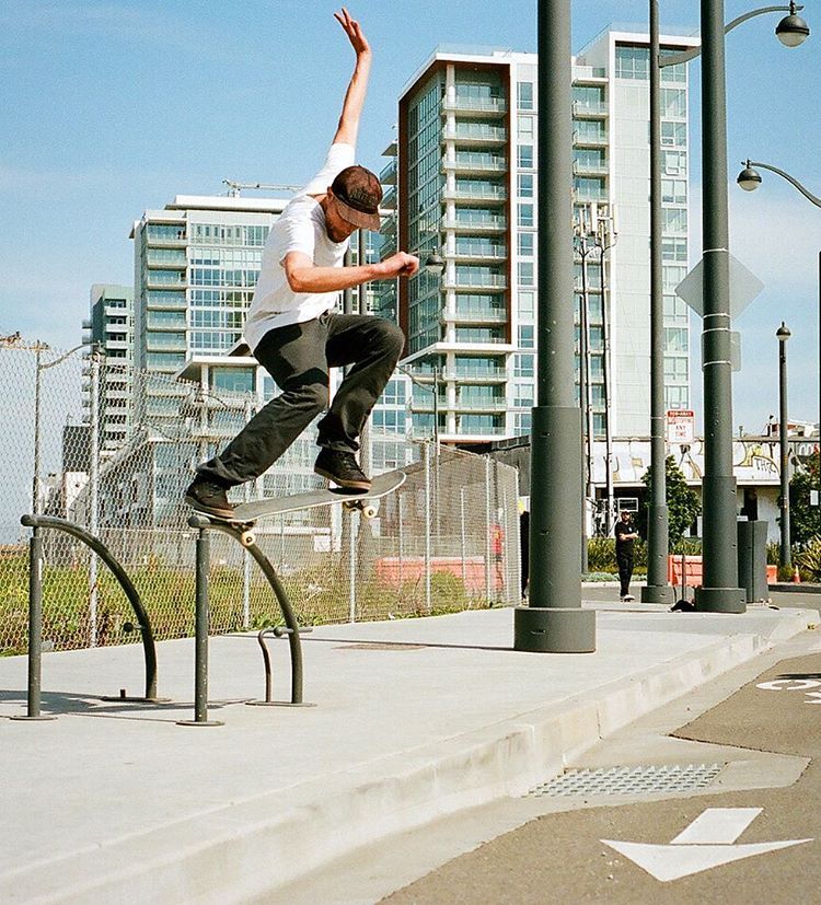
This is a little feature about a guy I don’t know personally, but has been on my peripheral radar since I was a 9-year-old skate rat in Utah.

If you were ever a skateboarder and grew up in Salt Lake City, you’re familiar with the name Andy Pitts. Andy is an incredible skateboarder and is a pioneer of the Salt Lake skateboarding scene, helping to start one of the first indoor skateparks, Connections in 1999 (with another legend, Mike Murdock), and creating the DH48 videos that inspired tons of little bad-kids like myself to build ramps, go skateboarding, and have fun doing it.

Credit: Slug Mag

Credit: Slug Mag

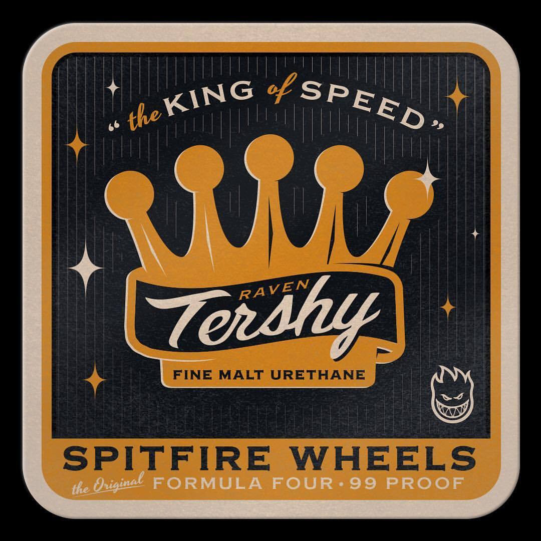
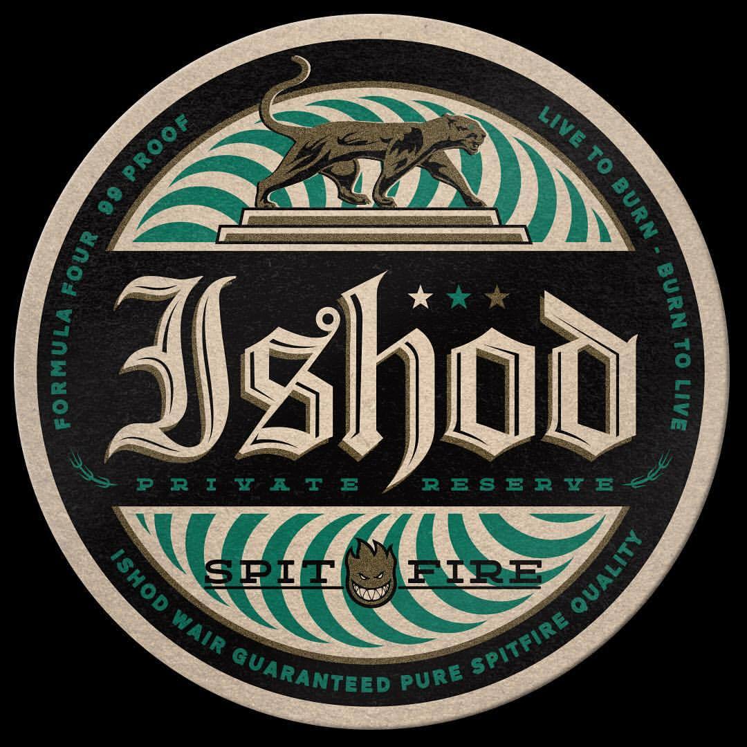
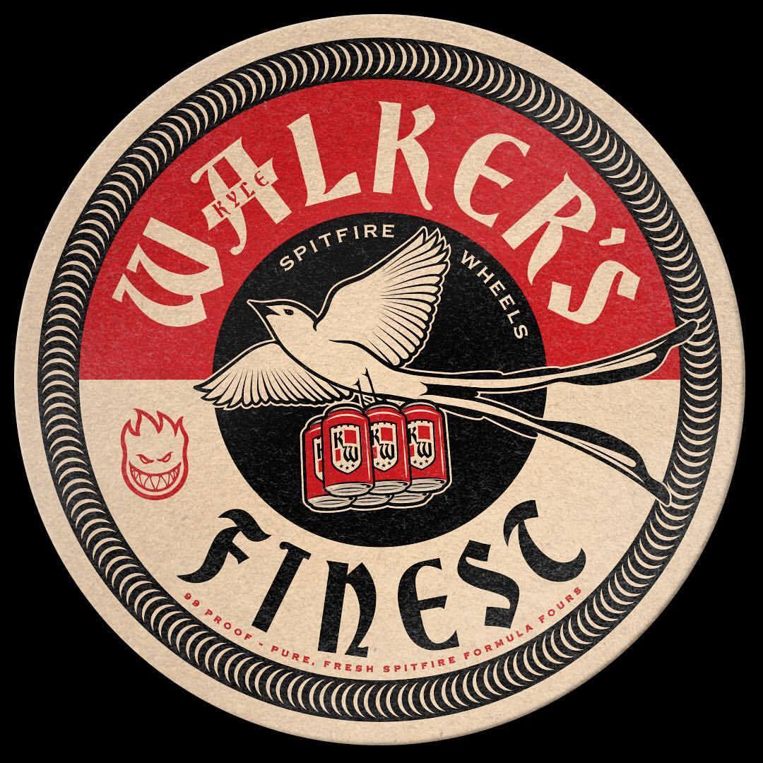
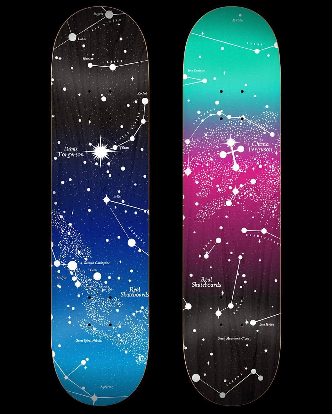
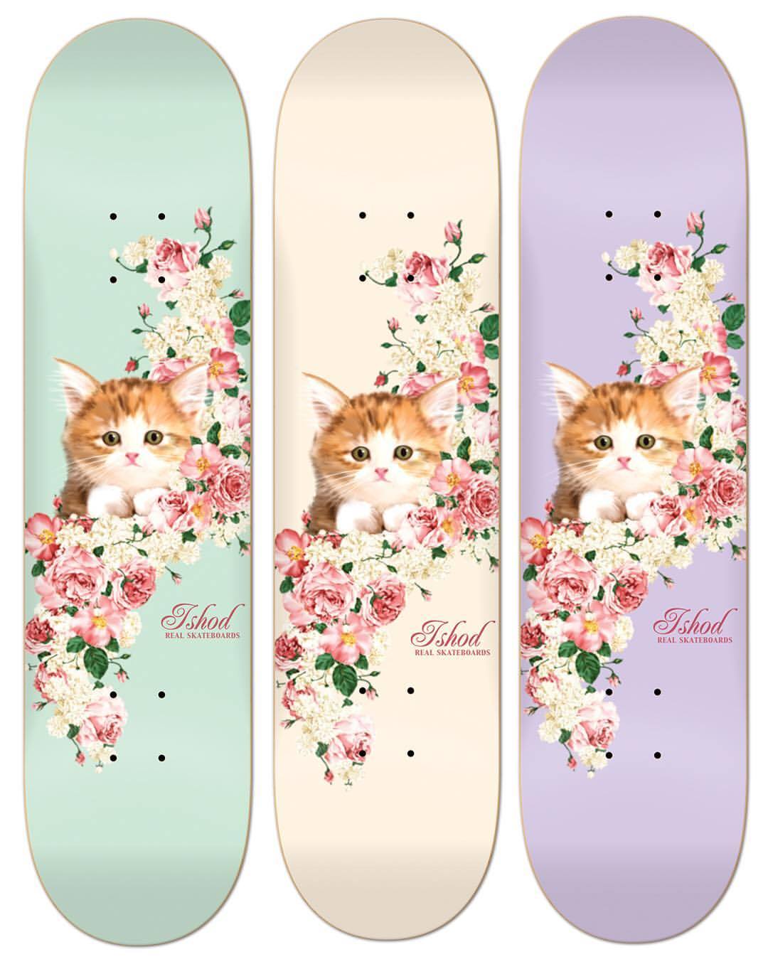
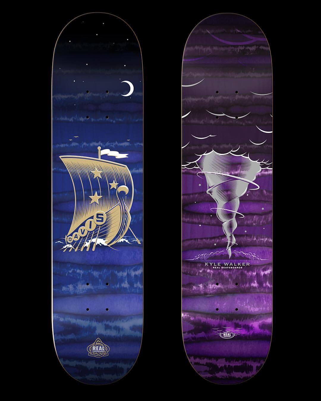
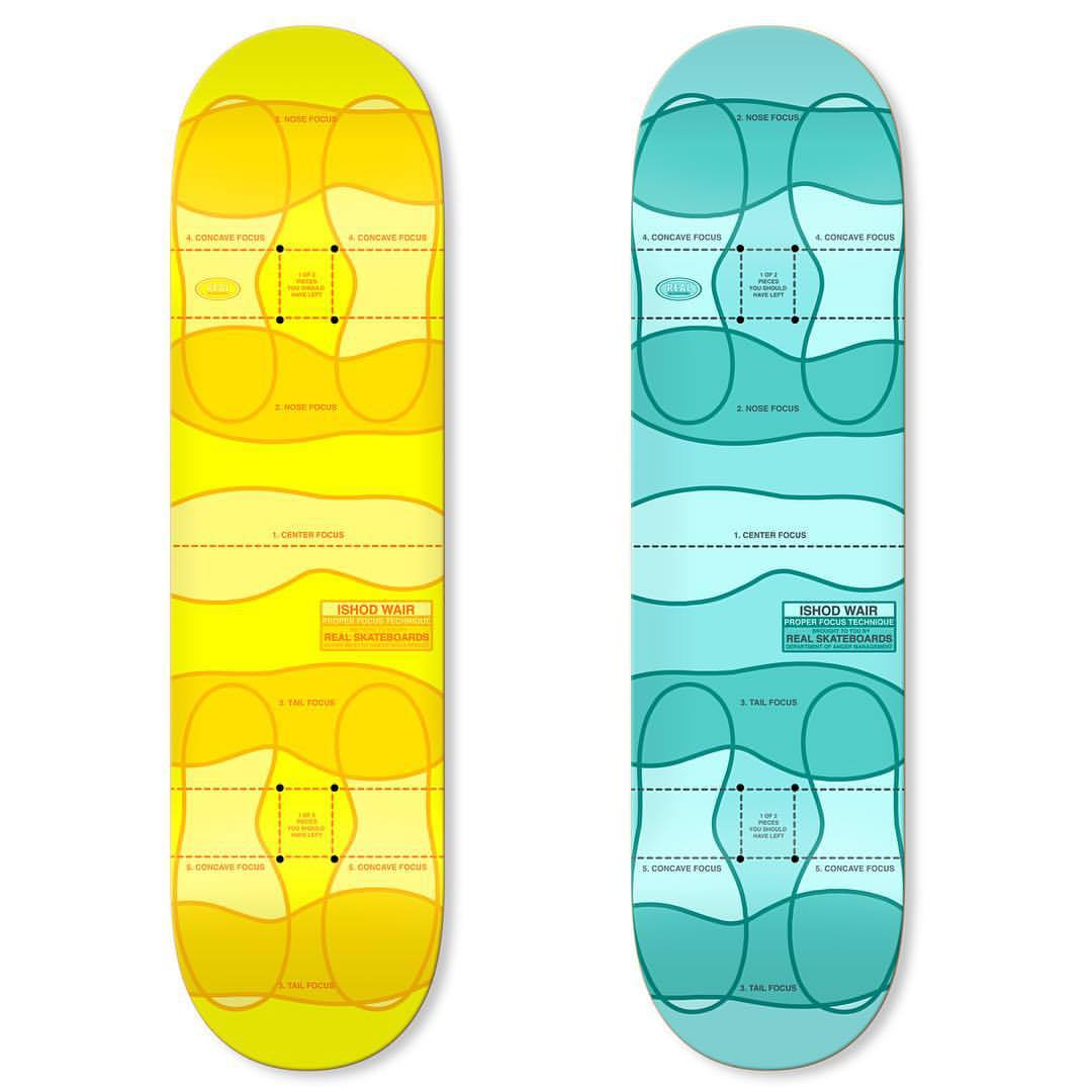
The reason I find Andy so brilliant is that he has built an amazing career combining my two favorite things on earth: skateboarding and design, and is currently the Creative Director at Deluxe Distribution overseeing creative work for Real Skateboards, Spitfire, Thunder, and Venture Trucks, all companies that I grew up idolizing. On a day-to-day basis Andy designs wheels, decks, and advertisements for some of the biggest companies and names in skateboarding, and I was motivated and inspired to learn how his journey came to be and sponge up some wisdom. 

Although I feel like there hasn’t been a ton written about it; design has always been an incredibly integral aspect to skateboarding, an unsung hero that contributed heavily to the image and culture we know today. The industry has produced some of the most incredible designers, illustrators, and thinkers who, in the true nature of skateboarding, are constantly pushing boundaries to create amazing work. If you aren't too familiar with the amazing work artists/designers in the world of skateboarding have created, check out some of these artists who have inspired me:

Jimbo Phillips

Todd Francis

Todd Bratrud

Evan Hecox

And a million more I’m probably forgetting...

Anyway, after creeping the internet and doing some research I know that Andy started out as a Graphic Designer in 2005, teaching himself along the way. His connections in skateboarding led to freelance work for Deluxe, eventually leading to a full-time job in San Francisco as creative director. Apparently he also can build anything, is capable of drinking an infinite amount of beers, and is disgusted by apple juice.

Because he designs across many brands and mediums, Andy’s work spans a TON of styles. It’s also amazing that he constantly creates exceptional personal work in addition to managing the creative output for some of skateboarding’s most ingrained brands. I’m gonna stop rambling so much and share some of the shit I find super inspiring: check it out and get familiar:

Andy's Instagram account is full of gems and a highly recommended follow if you dig skateboarding, traveling, and great illustrative design. He seems to travel like a madman and designs all along the way. I find myself really inspired by his city-related illustrations which I can only describe as CRISPY & SMART:

Andy is a truly badass human (he sent me an AMAZING little 'zine involving tin-foil hats and brainwaves just because I reached out on Instagram), and was super-receptive when I asked him if he would be down to answer some questions for a miniature-interview (mostly for my own selfish-learning benefit because I don't know how many people read this...). It took me a while to concoct the right questions and I hope I don't come off as too much of a creeper but here are some thoughts from Andy about design, skateboarding, and just random stuff in general:

Ahoy Andy! Thank you a million for the mini-interview, I'll just jump in:


Was there any particular artist/moment/epiphany that lead you to start design/freelancing? Did you dive right in 100%?

I had been doing a lot of personal art and little things for shops in Salt Lake. I read an interview with Winston Tseng (Enjoi’s Art Director) and just decided to cold-email him to find out how one goes about working in the skateboard industry. He was kind enough to respond to me with some tips and advice from his perspective. From that moment on I was all about it, working at bettering my range of skills and making the right connections within different art rooms to land some freelance jobs at a variety of companies.


Random, but I'm just super curious; how many decks/wheels/trucks do you design in a year?

I can’t honestly say as it is a constant flow of projects for all the brands, that are all continuously stacked and over lapping. Right at this moment in time, I’m concurrently working on 12 different decks, 3 wheels, a couple tee shirts, stickers etc, an ad, and 2 trucks. This is pretty a typical list/day for me - when I get one of those pieces out the door, another one will shuffle in and I’ll get that going in the mix. All the burners are usually fired up with lots of stuff cooking at once. A guess would be maybe a hundred different things in a year? a hundred fifty? I really have no idea.


How important is design to skateboarding? For instance, will someone choose a product based on a cooler graphic over the company/pro they prefer?

Every single person is different in what they do, choose, prefer and think.  That’s the beauty of life. The only thing I really know is what goes on in my head, beyond that I can only take guesses at why someone would want thing A over thing B. I’m sure there is a marketing room psychologist in a board meeting somewhere who tries to understand what is cool - but for me personally, I just try and make stuff that I like, am hyped to work on and hopefully someone else in the world will find compelling, interesting or inspiring.


What current designers crush it/inspire you (skateboarding or otherwise)?

Everyone here in the Deluxe artroom kills it - it’s rad to work with this crew of dedicated creatives who just flat out love skateboarding. I get inspired and motivated by anyone I see putting an intense amount of love and passion into something they are working on regardless of subject.


Do broader design trends affect design in the skateboard industry?

We’re all steeping in the same tea.


Do you work at all with the skateboarders who you are creating designs for?

I love it when someone has input or direction for what they want. It’s a full spectrum of input from people though, I get everything from detailed visual information, all the way down to not caring at all.  


What would you recommend to a designer who wanted to work in the skateboard industry?

Be diverse. Be able to do a variety of artistic things well. Illustration,  graphics, layout, typography, color, collage, painting, construction, brainstorming, screen printing, concepting, video, motivation etc. The more skills you have honed and bring to the table, the better off you will be if you are looking for a permanent artistic position in the skateboard industry.  Plus having lots of interests makes for nice, well rounded living.


Salt Lake City or San Francisco?

Aw man - San Francisco is definitely a cozy home for me right now.


Favorite trick to do?

Cramming in all the different things I want to do in the 16ish hours that I’m awake every day.


I think that's all I got without getting too deep:) Thank you SO much! I can't tell you how much I appreciate it. 


Hopefully anyone reading scopes the awesome work Andy makes and learned some cool shit!

Brilliant: the posters of Felix Pfäffli by Zan Barnett

ZanBarnett-Hero_FelixPfaffli.jpg

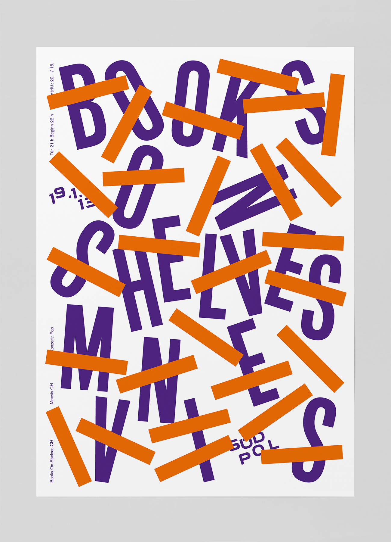
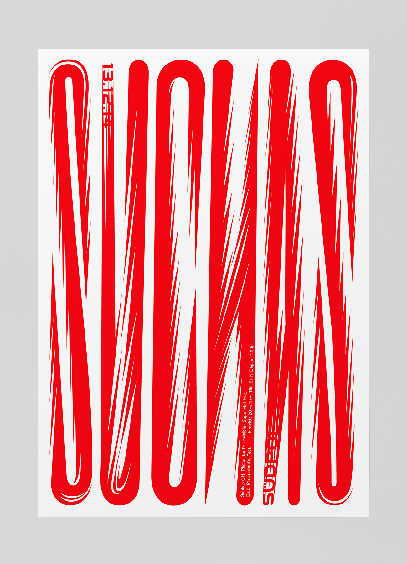
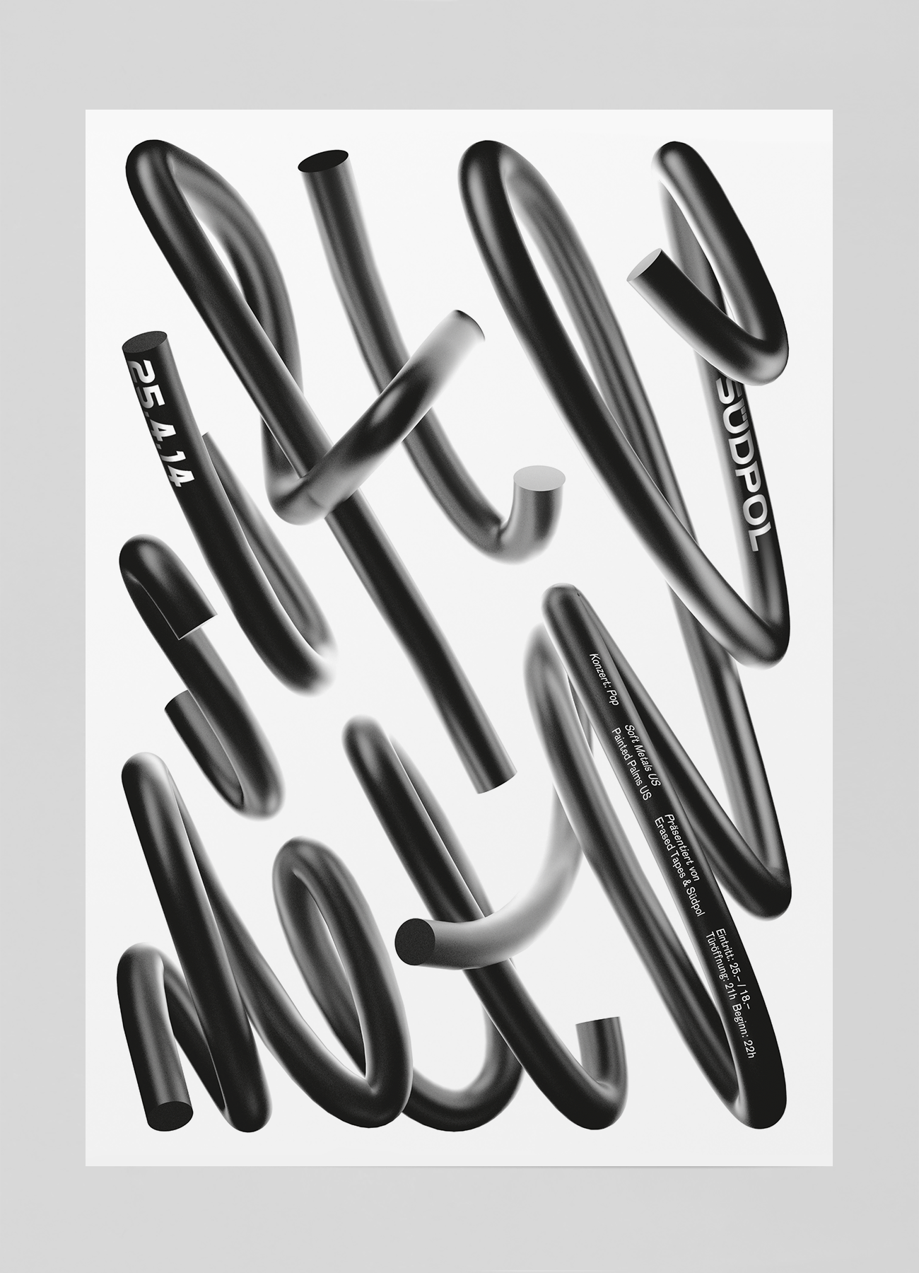
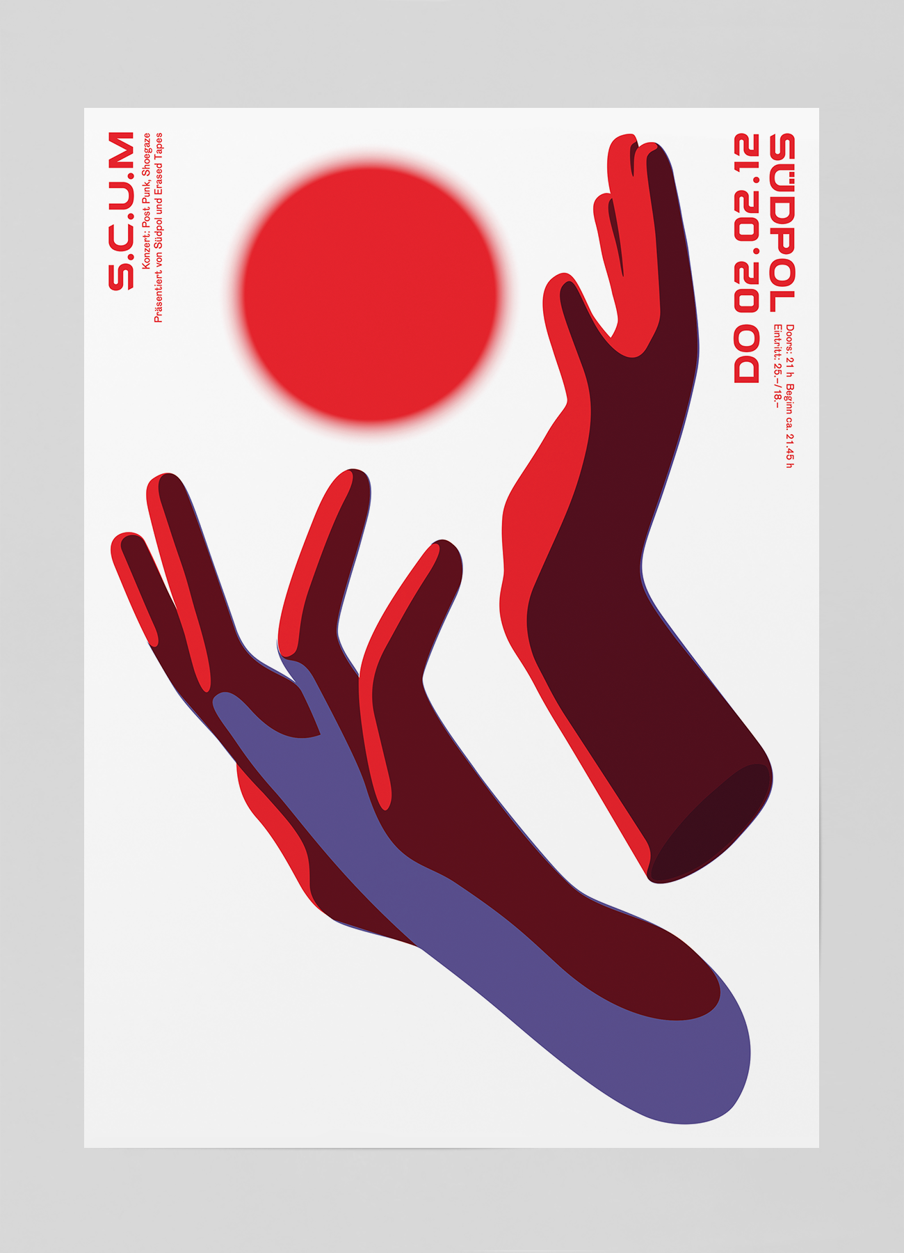
While surfing around the internet I came across maybe my new favorite design studio, Studio Feixen. Their incredible portfolio led me to discover Felix Pfäffli, one half of Studio Feixen who designs some of the most badass posters I have ever seen. Monotype has an incredible article about his amazing posters, and author Emma Tucker sums up Pfäffli's work very well:

Designer Felix Pfäffli’s vibrant posters are a cry for typographic rebellion, using expertly manipulated letterforms to prove that rules are there to be broken. 

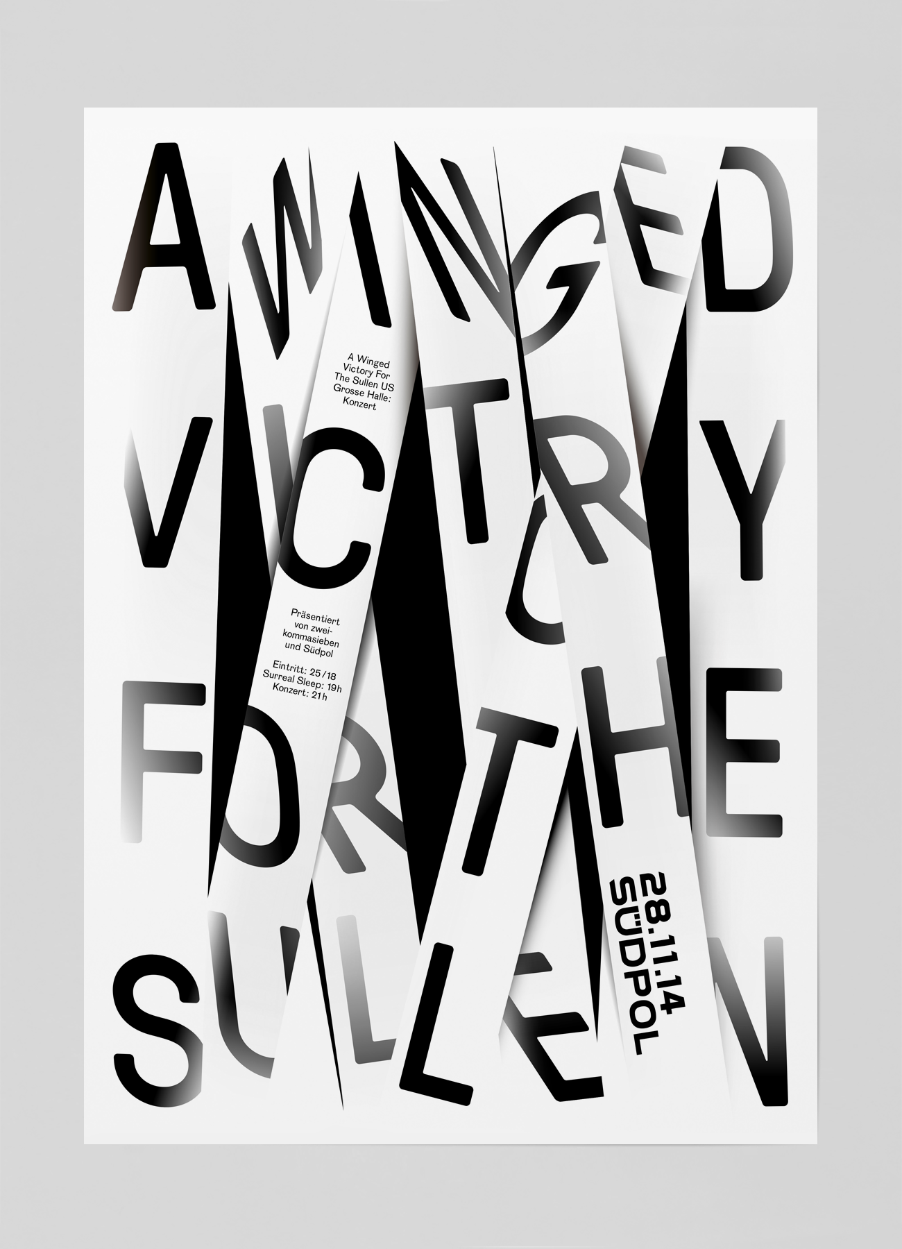
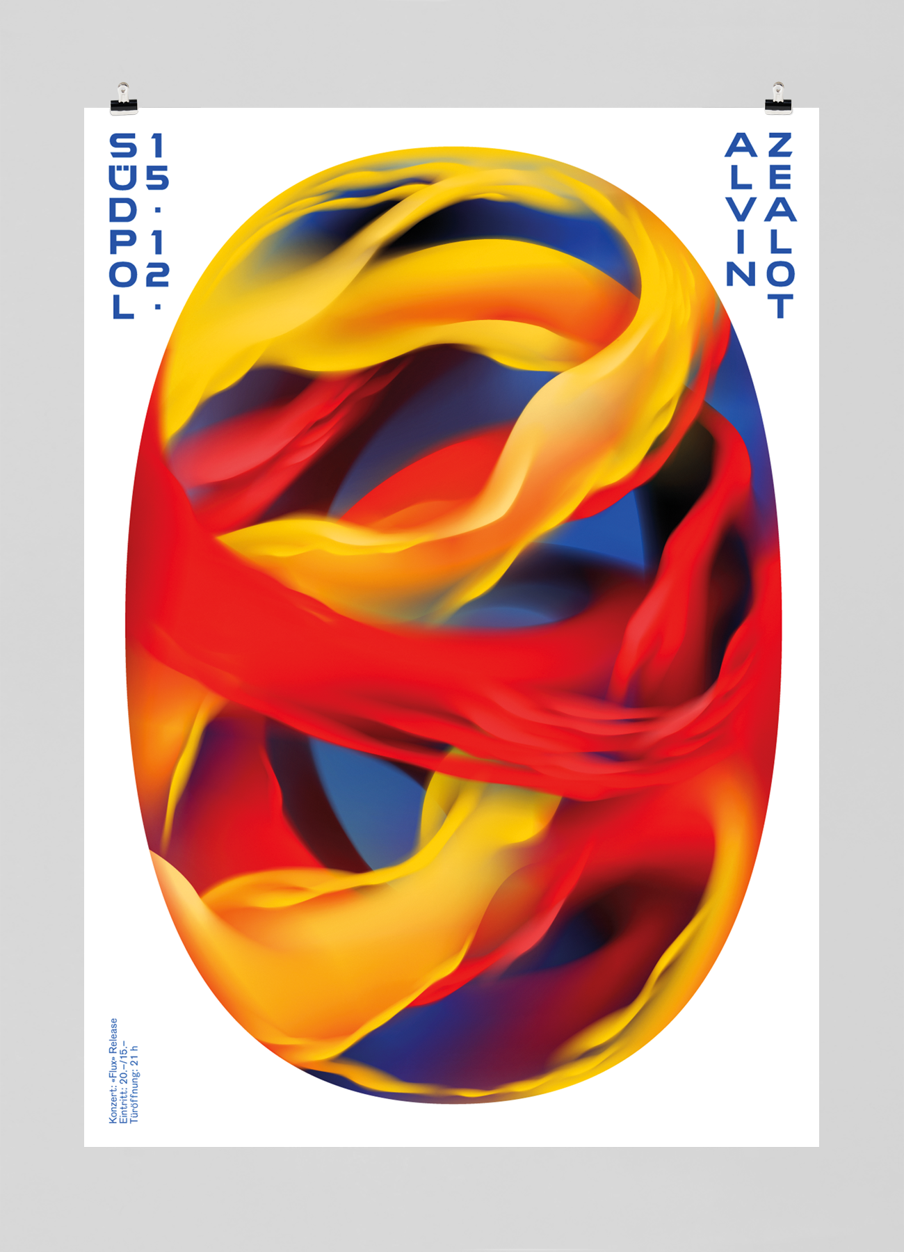
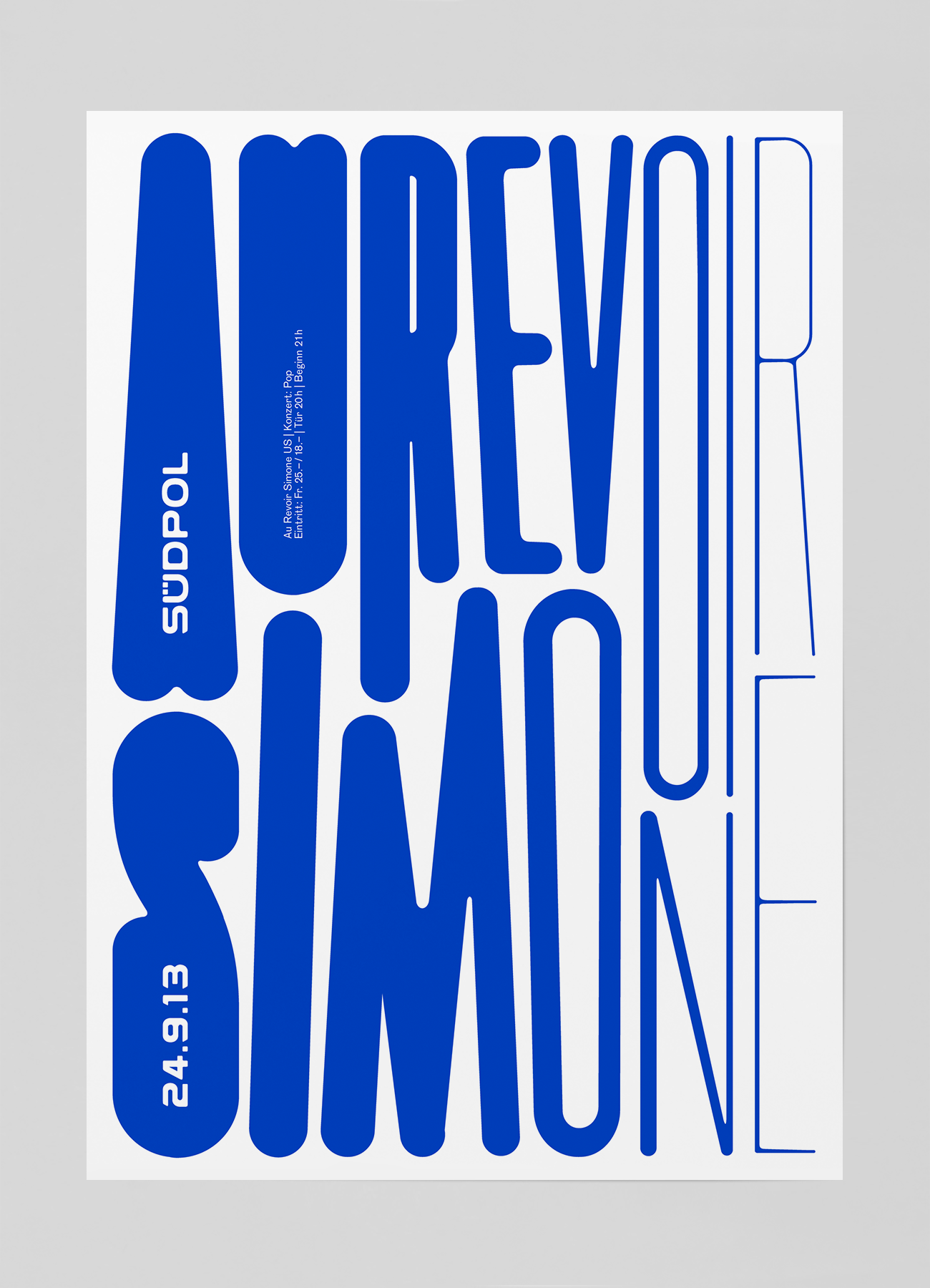
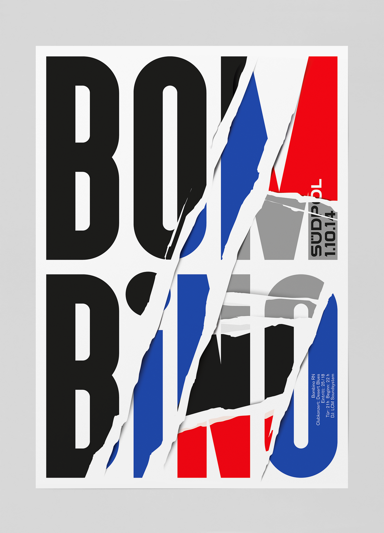
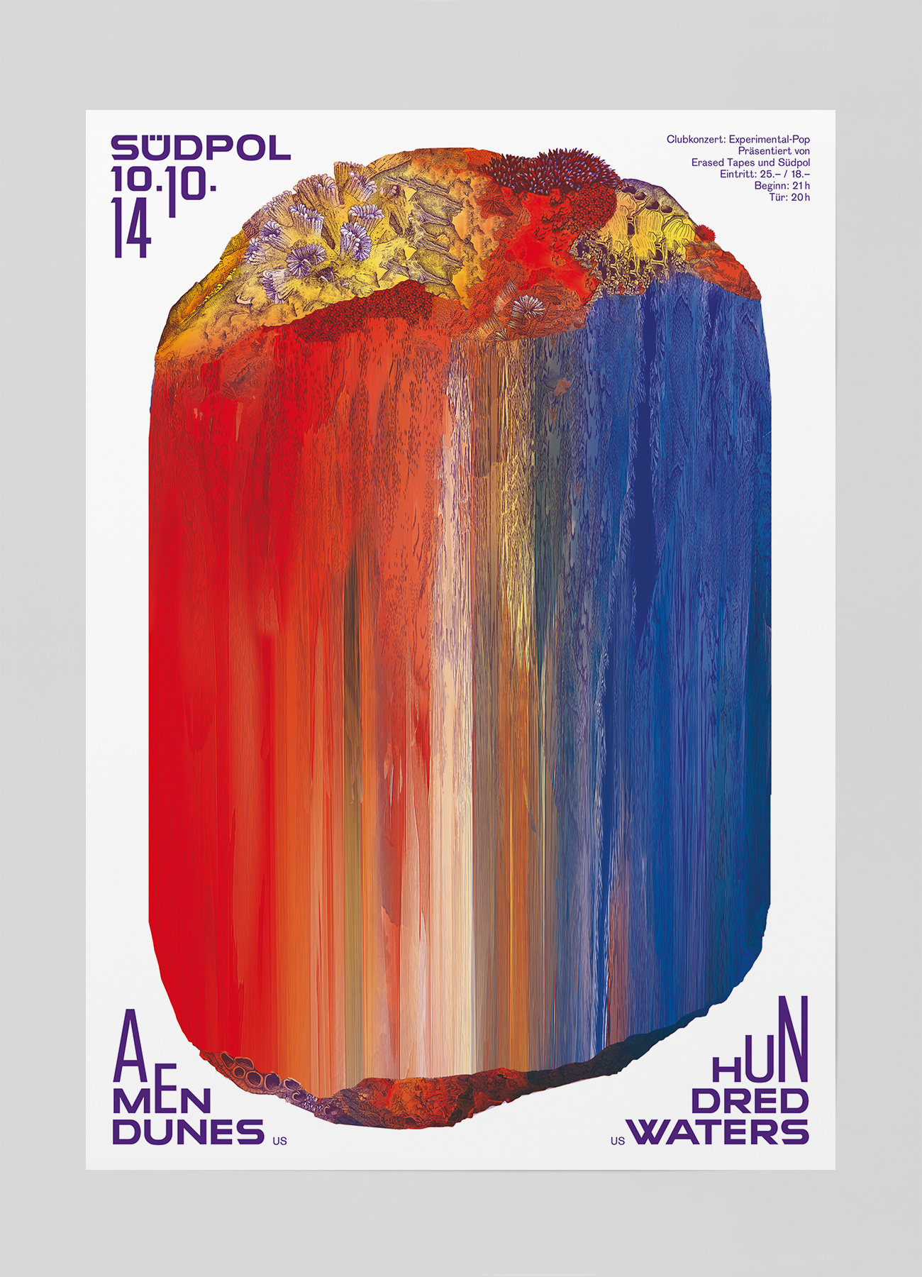
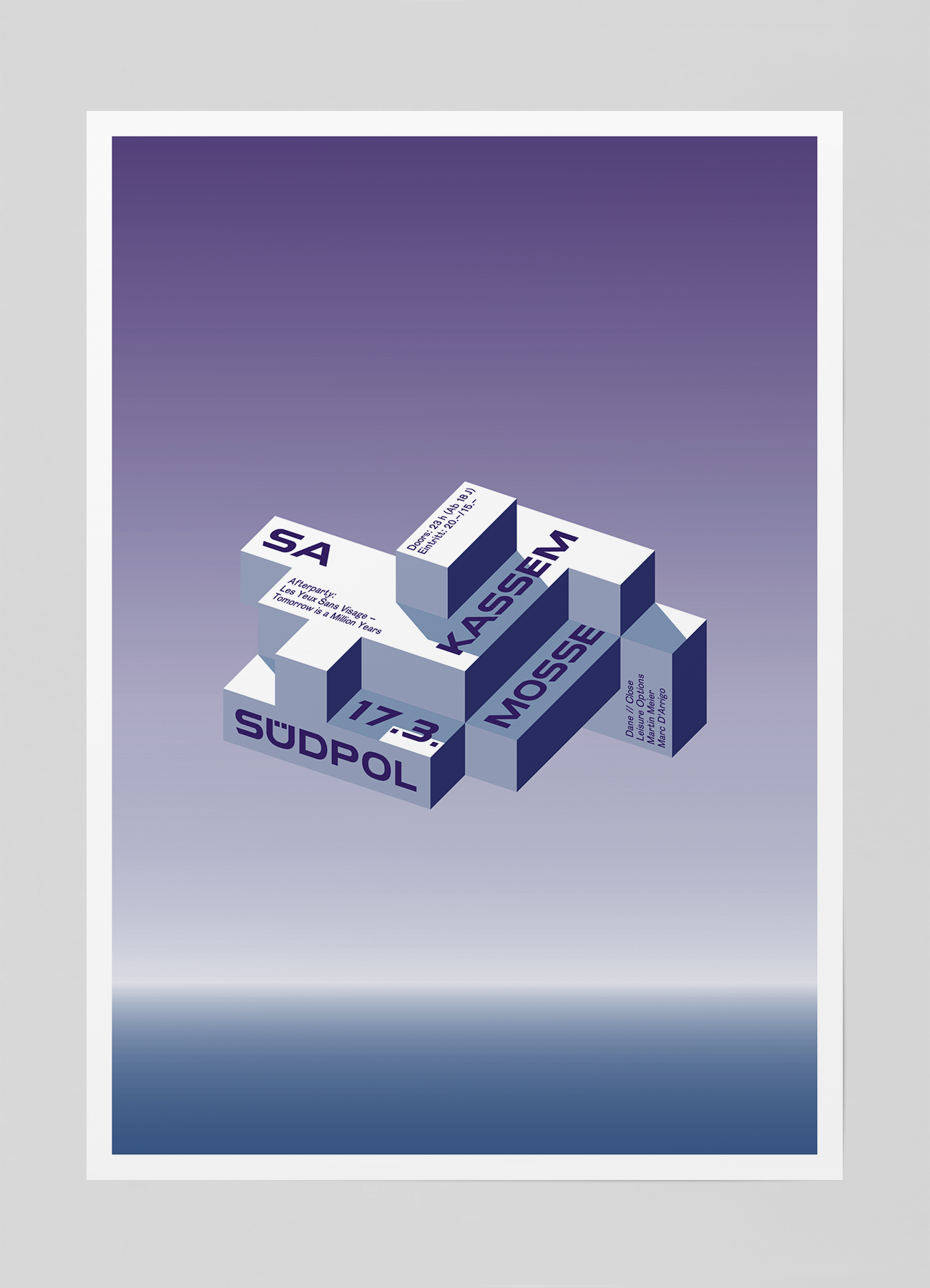
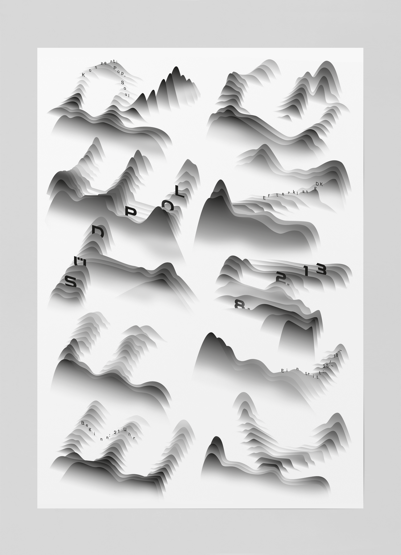
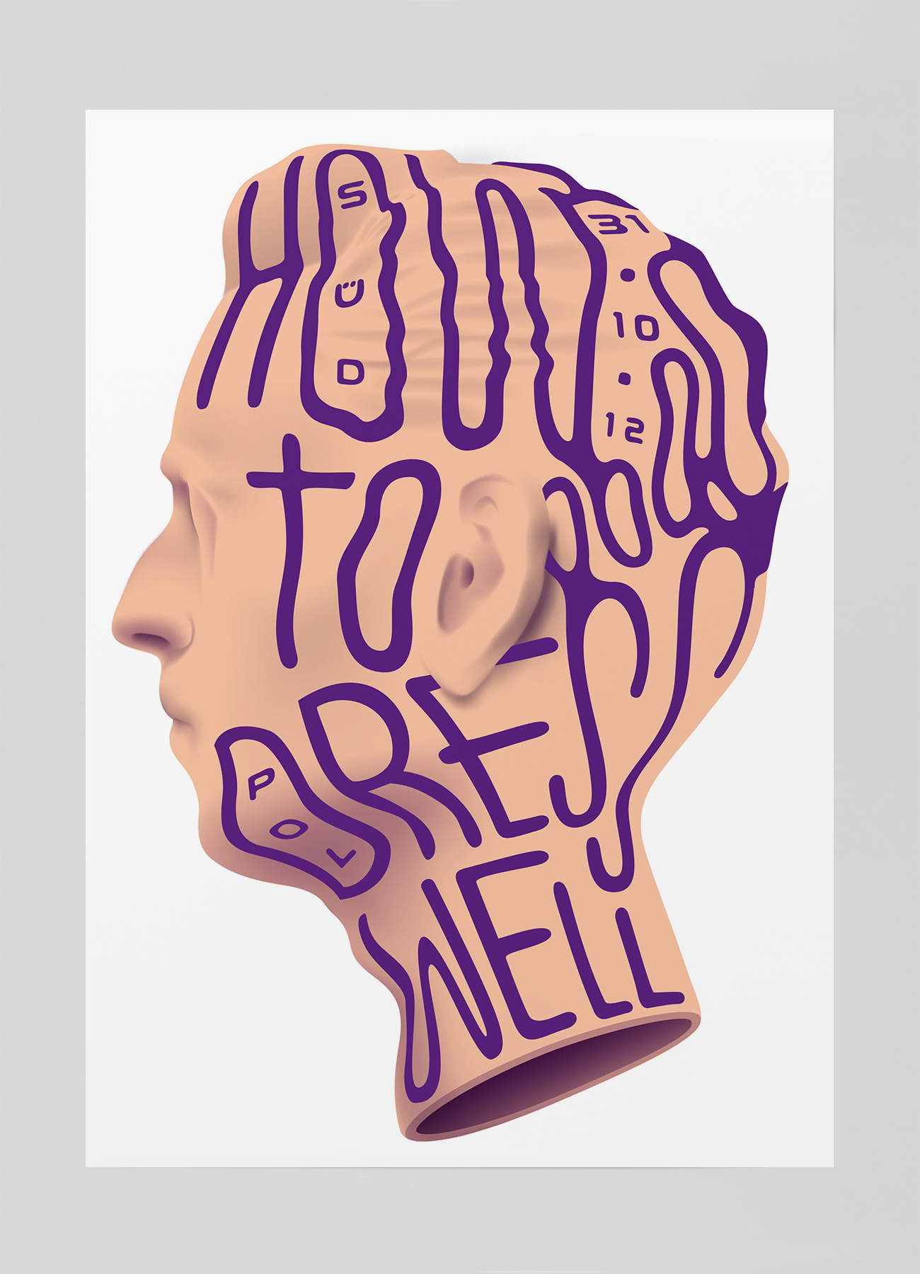
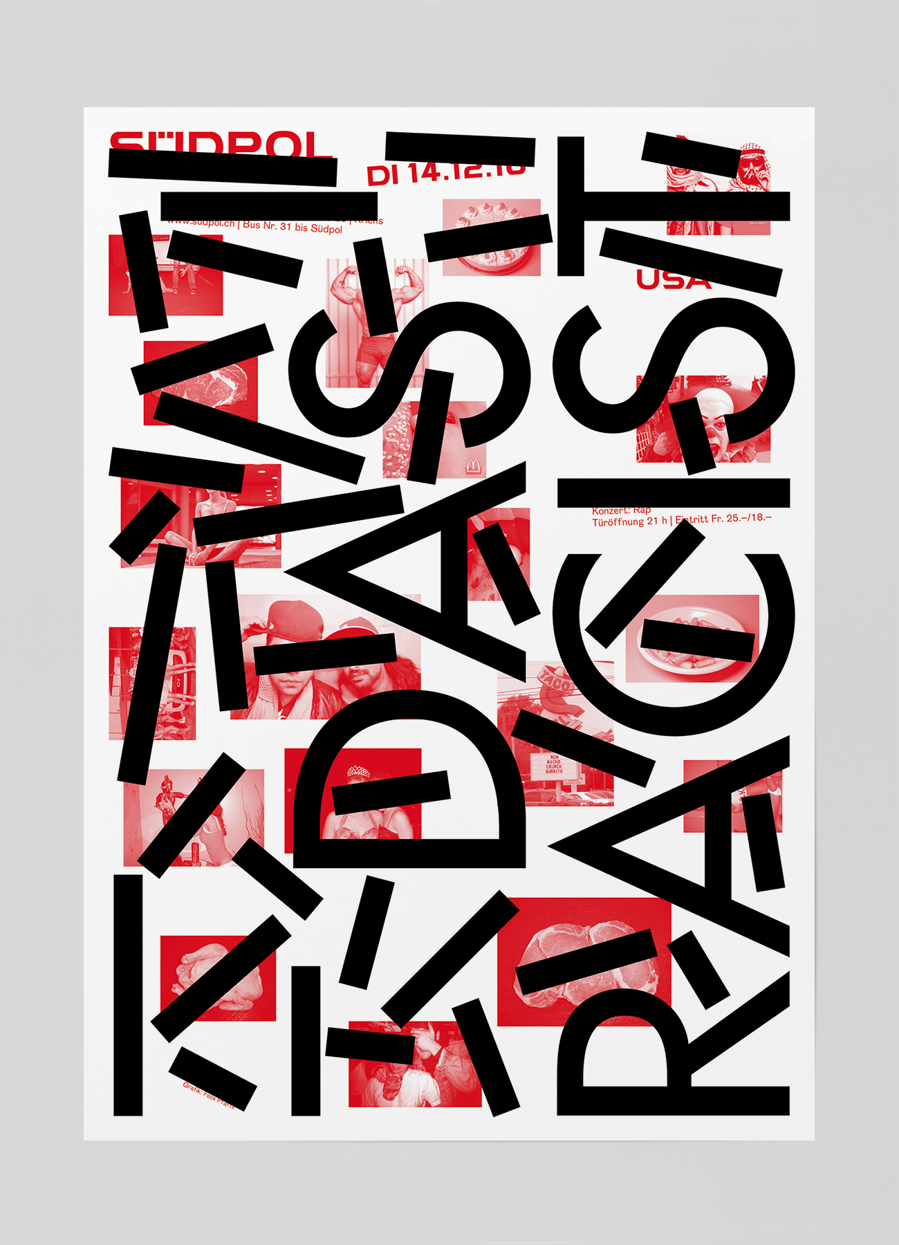
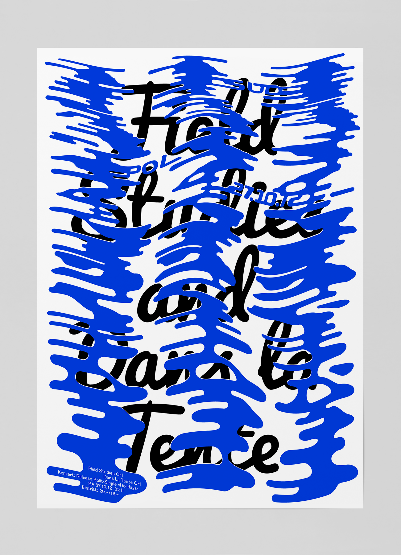
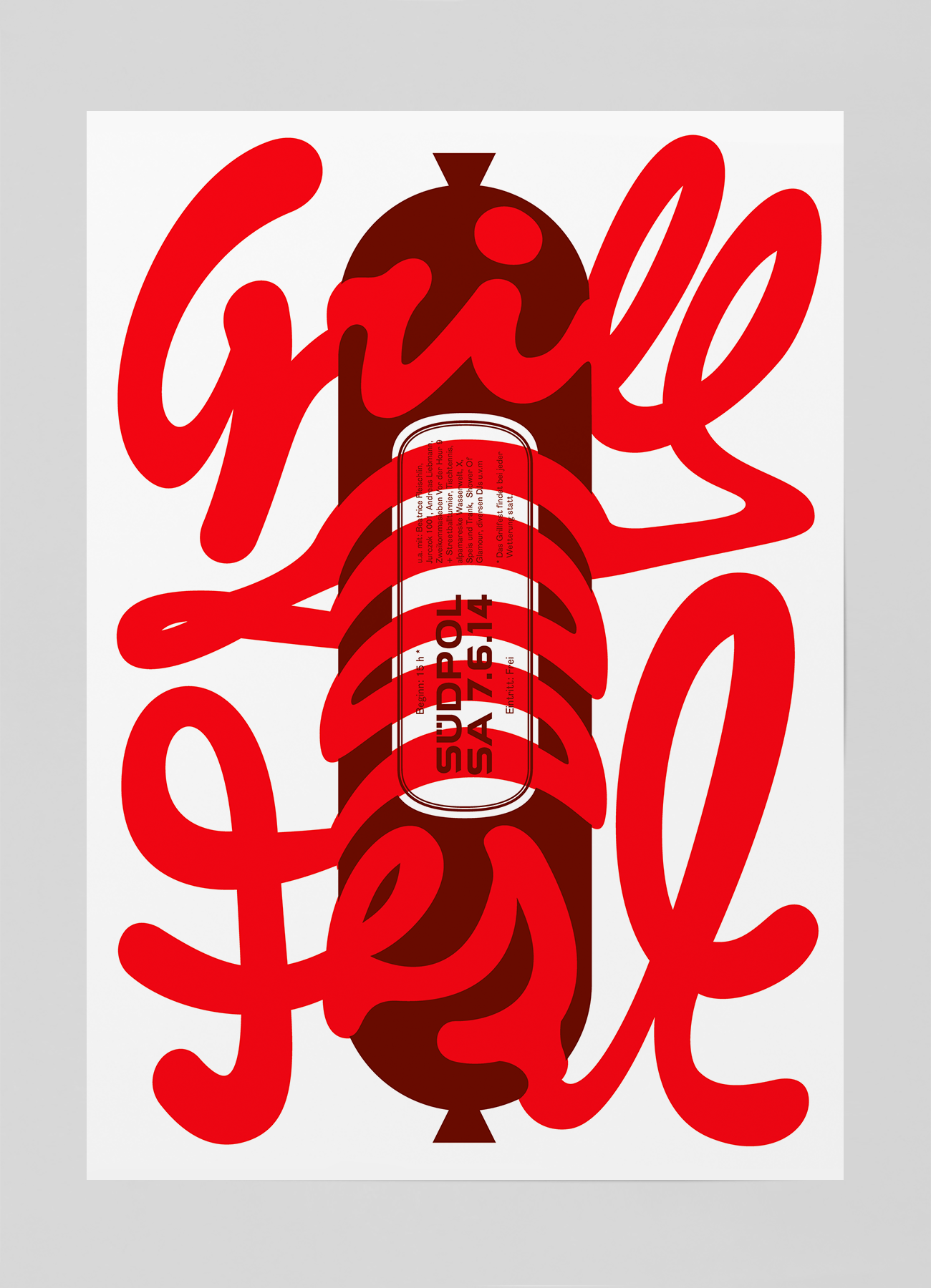
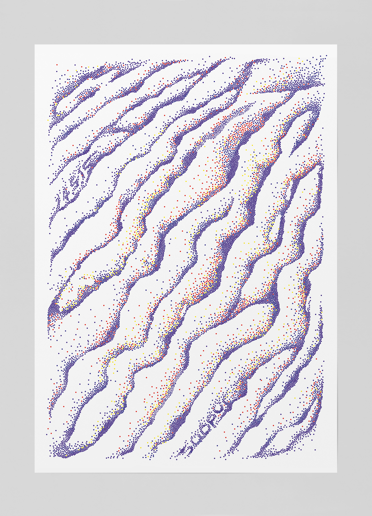
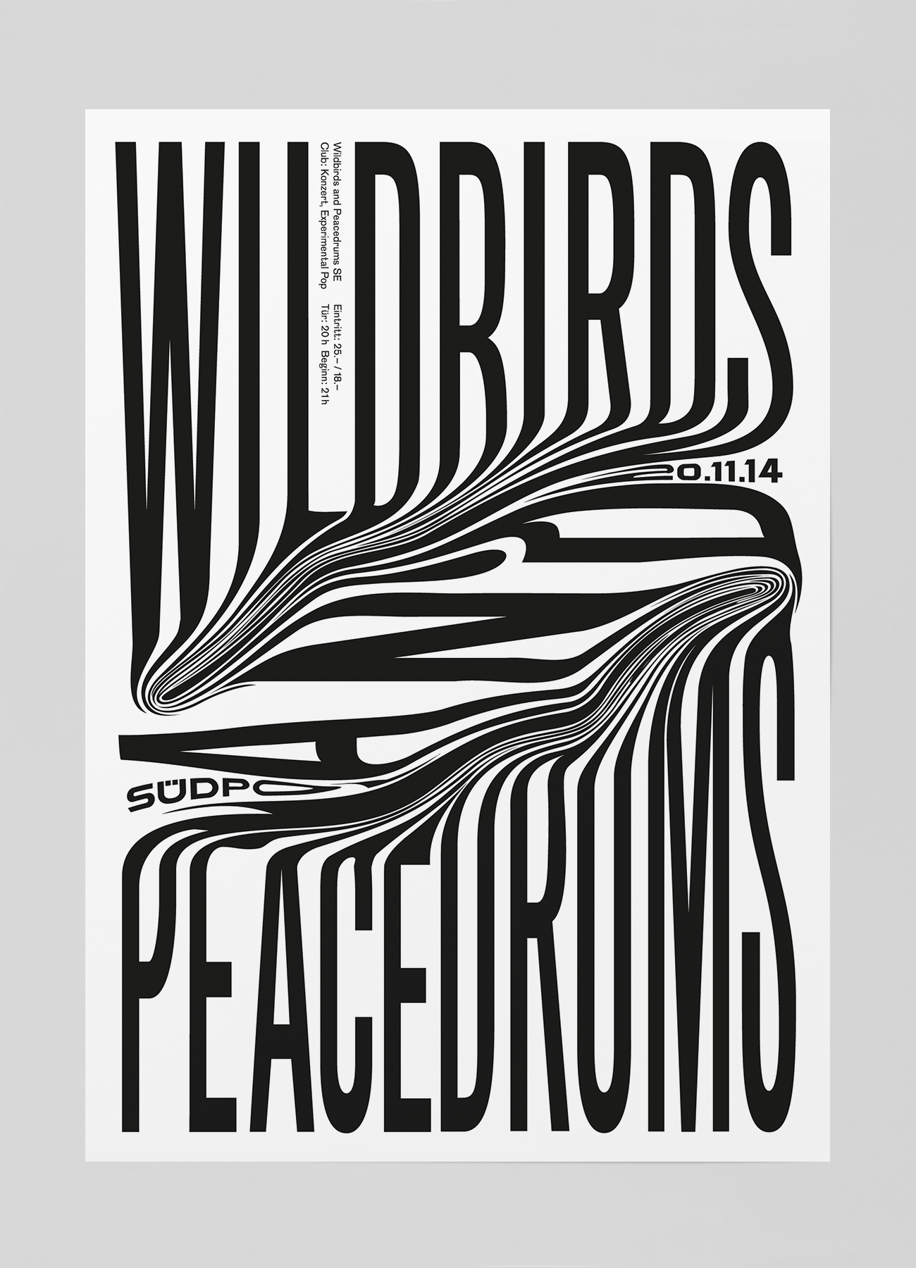
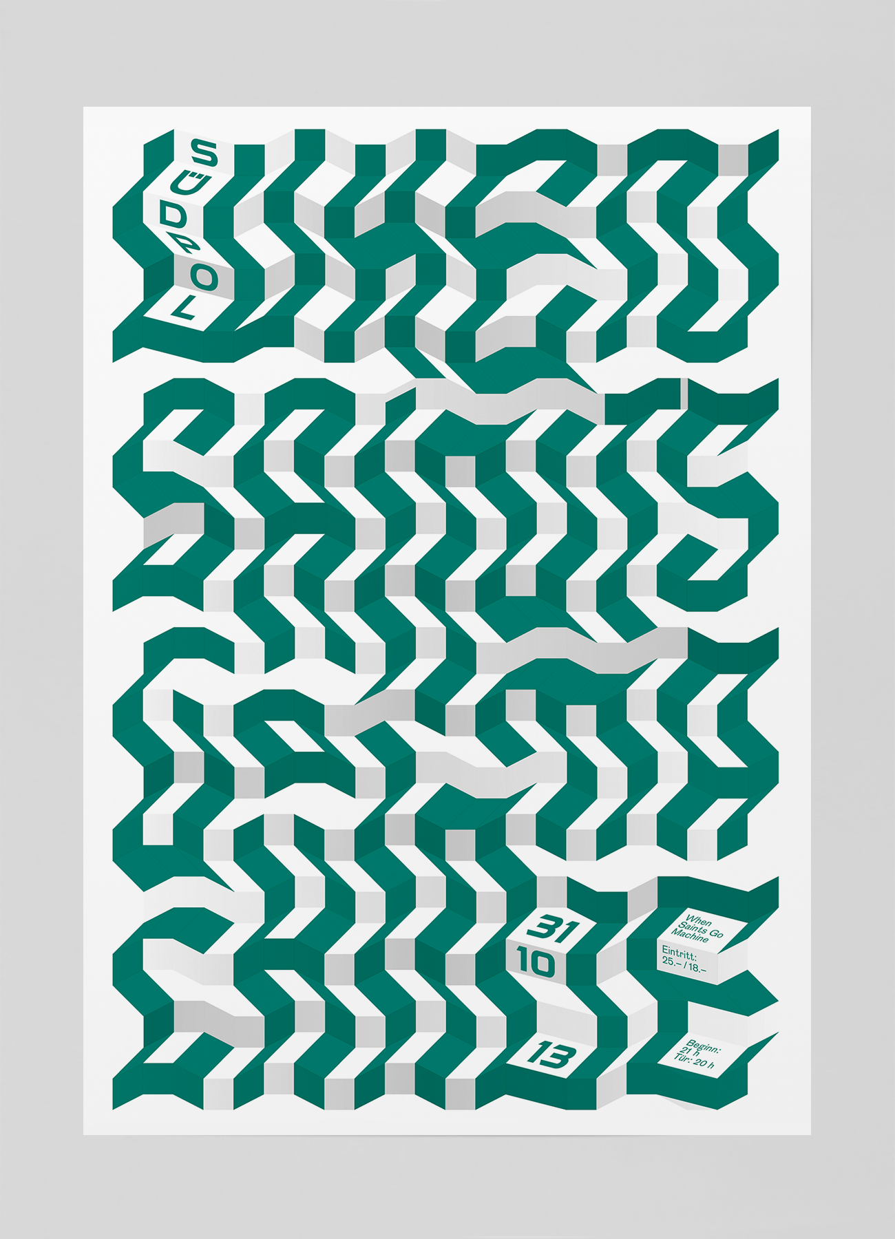
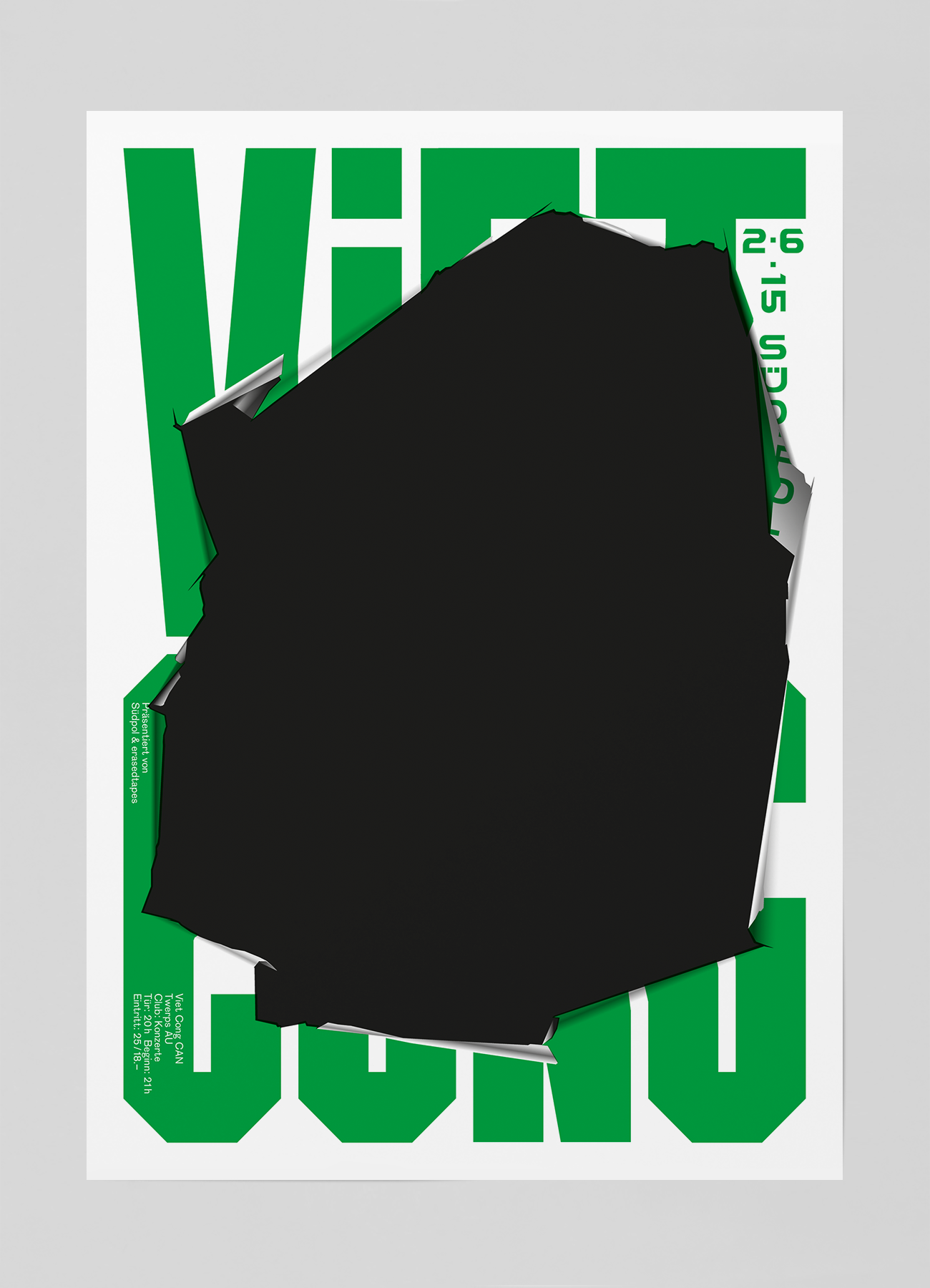
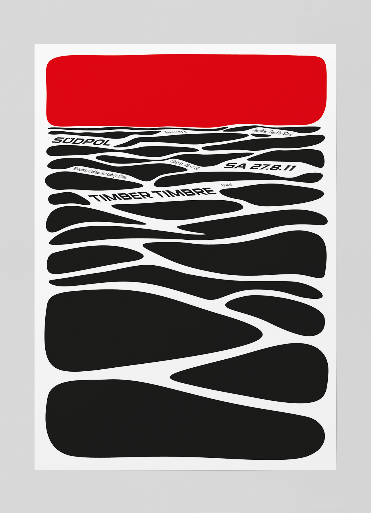
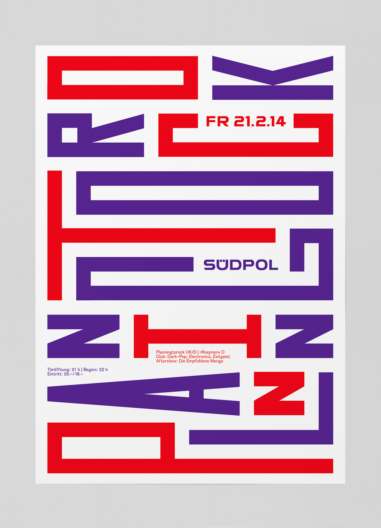
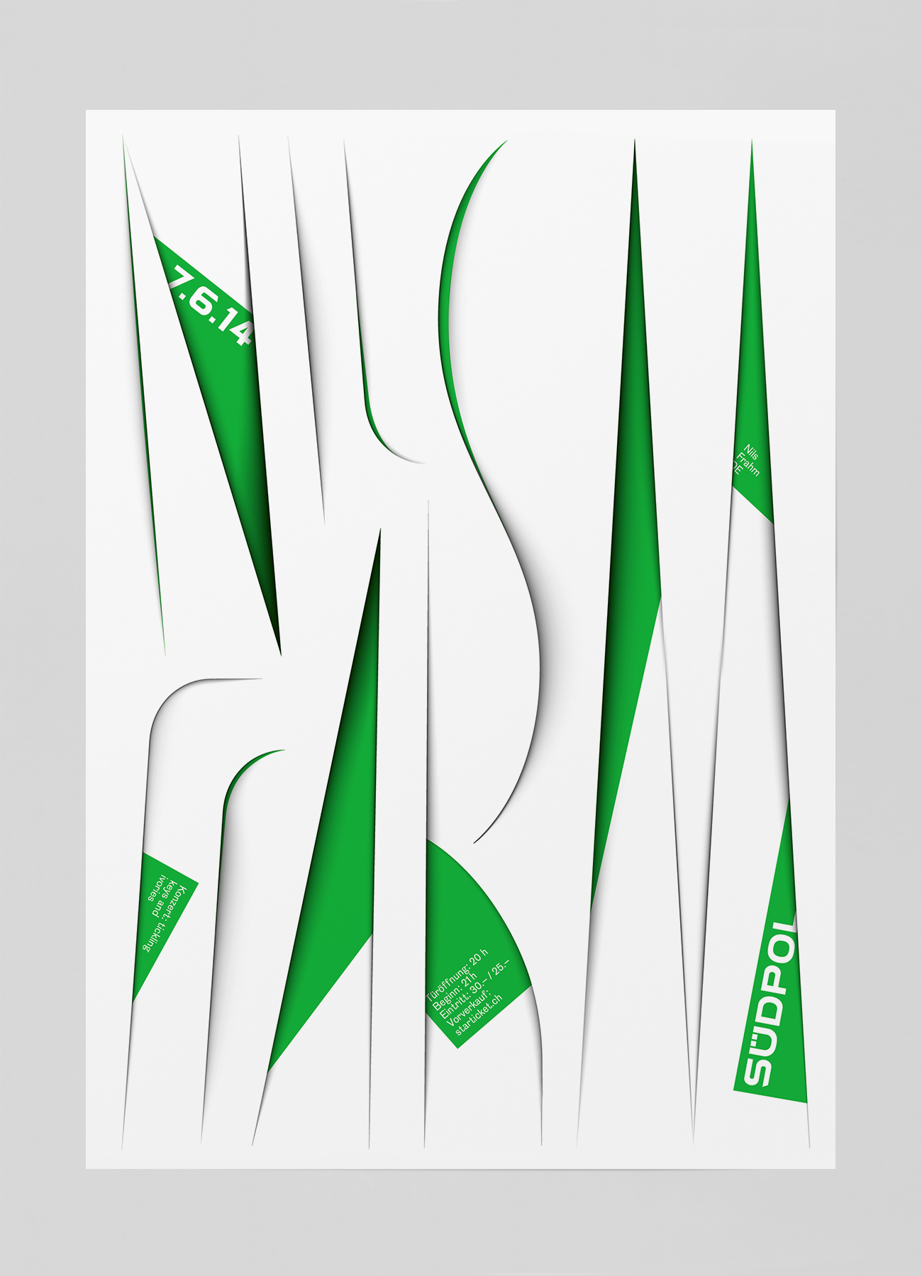
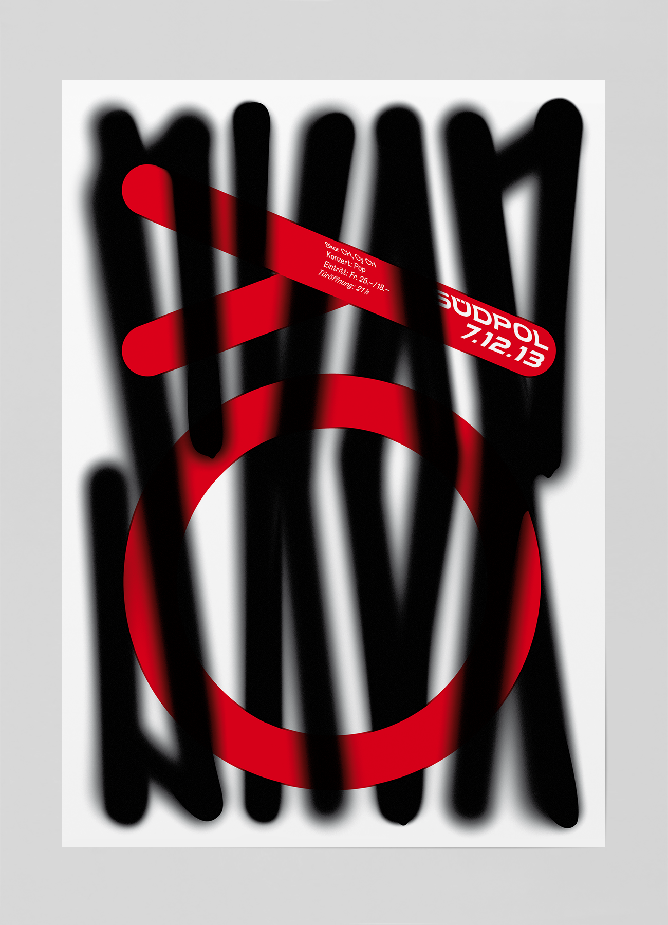
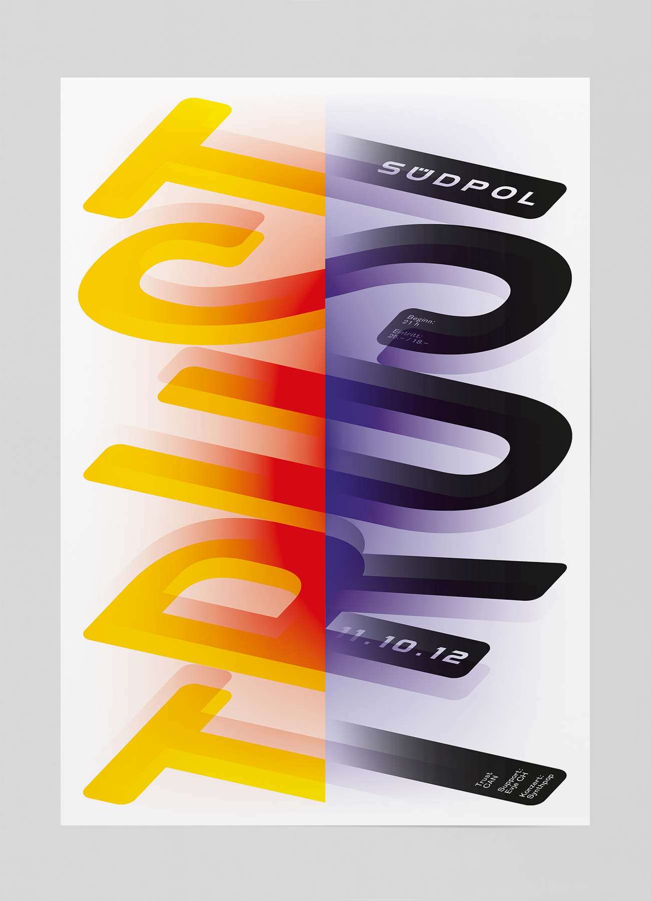
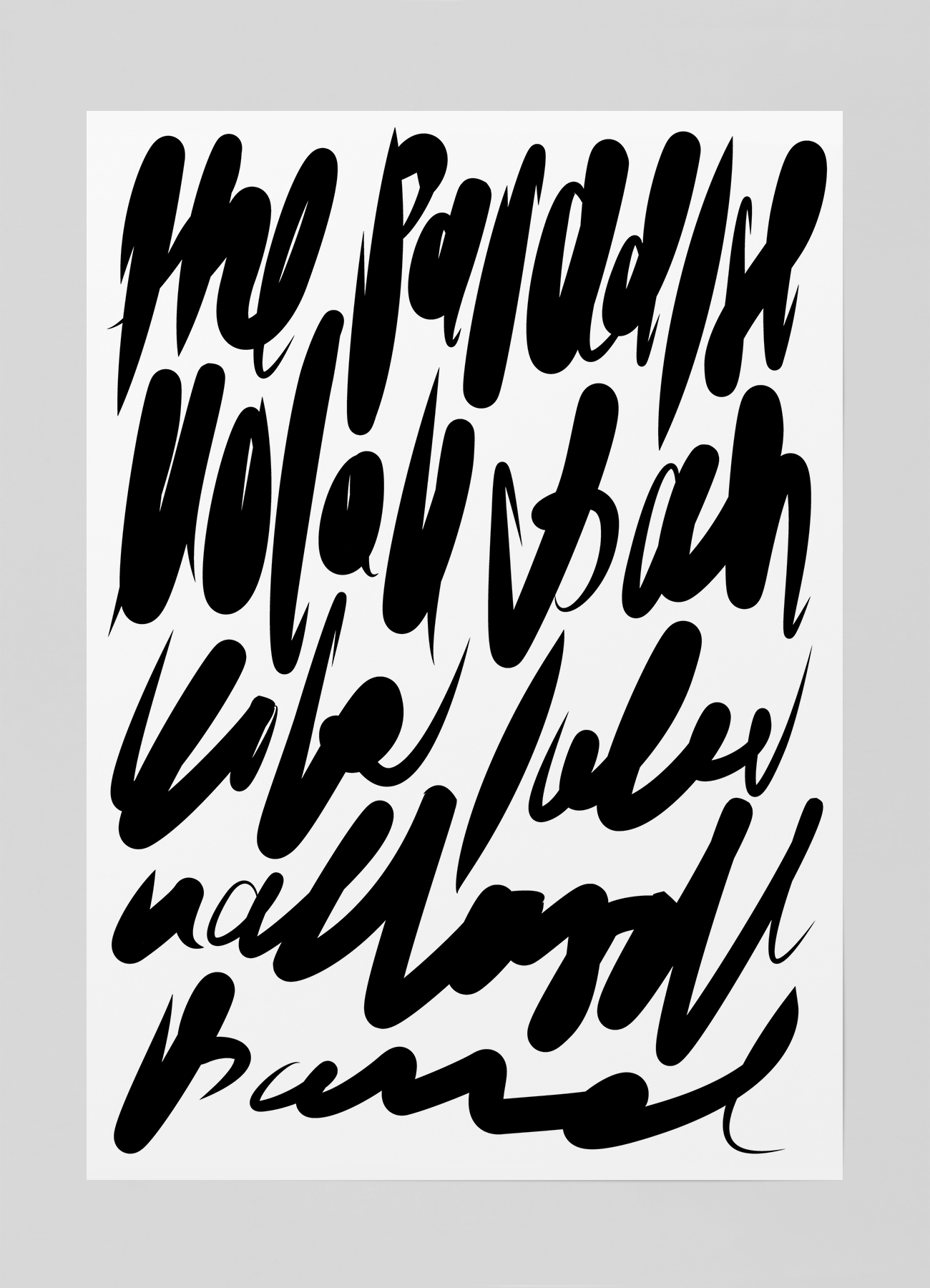
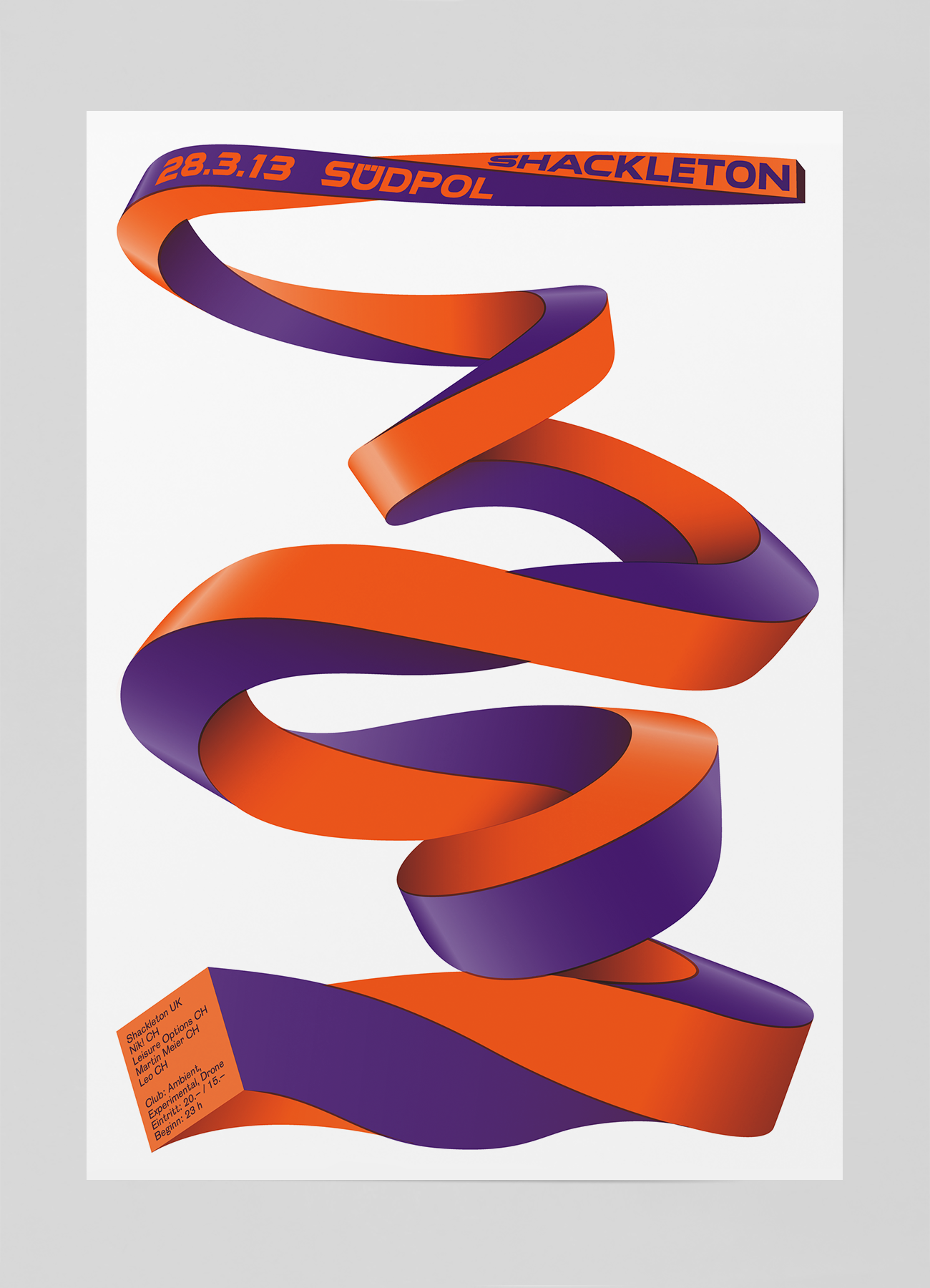
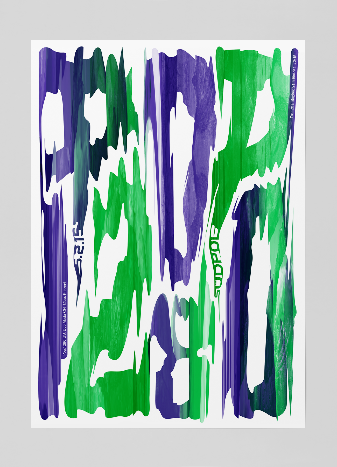
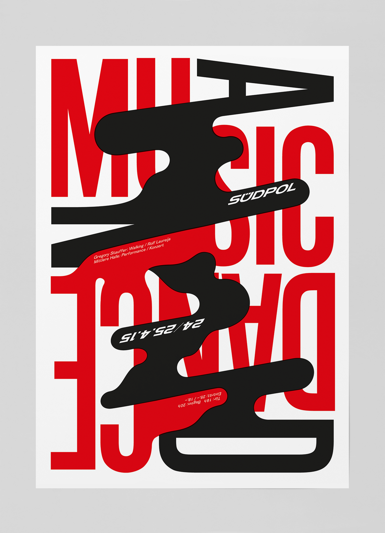
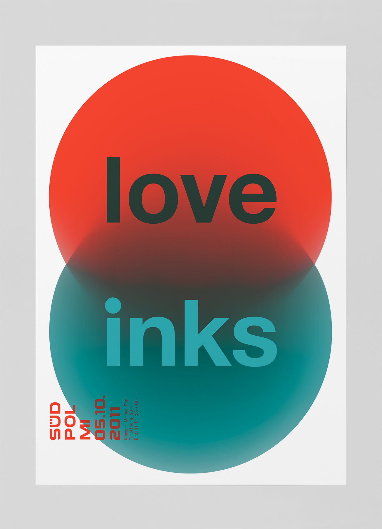
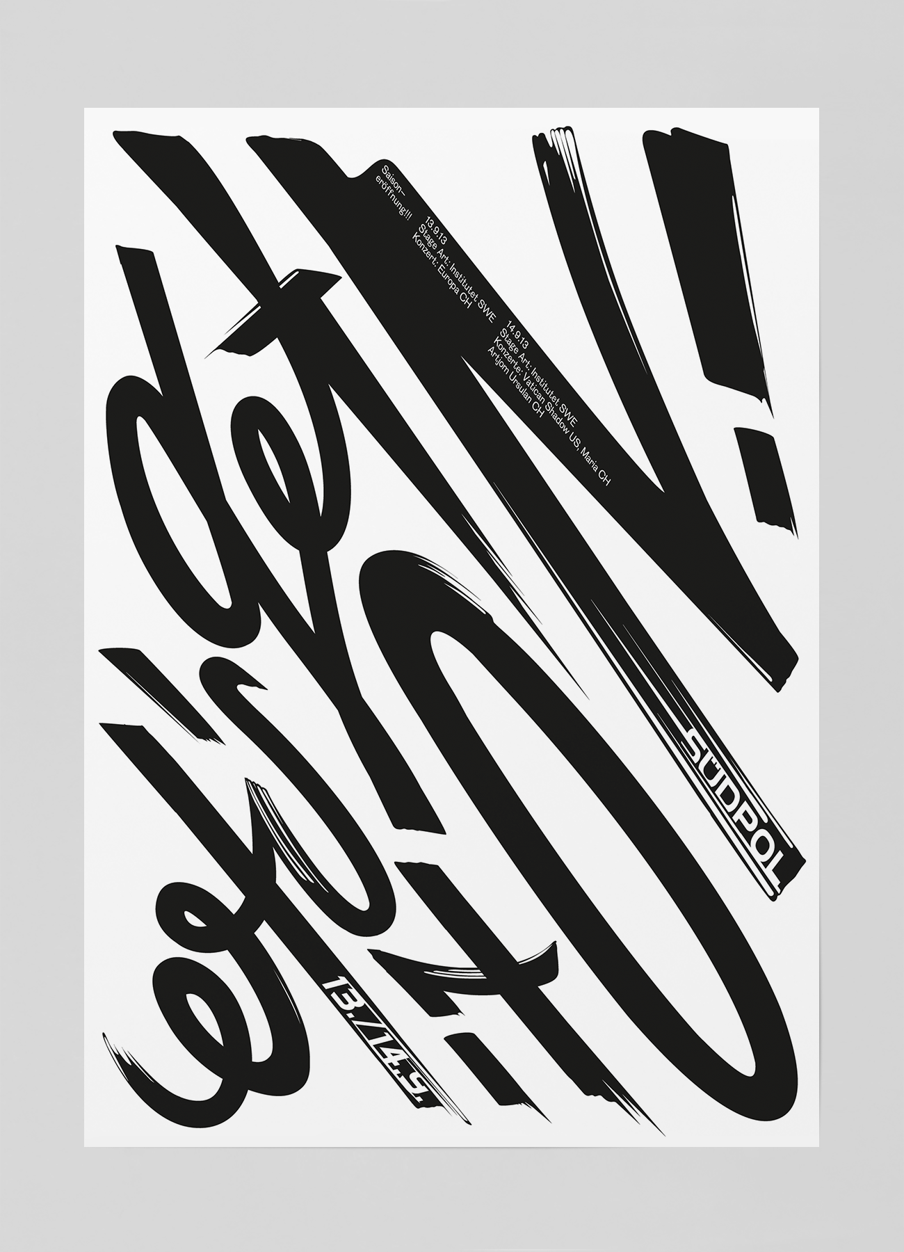
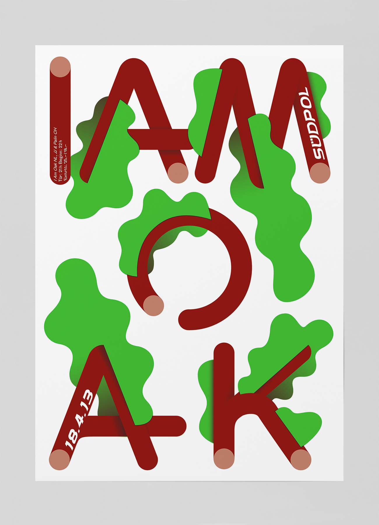
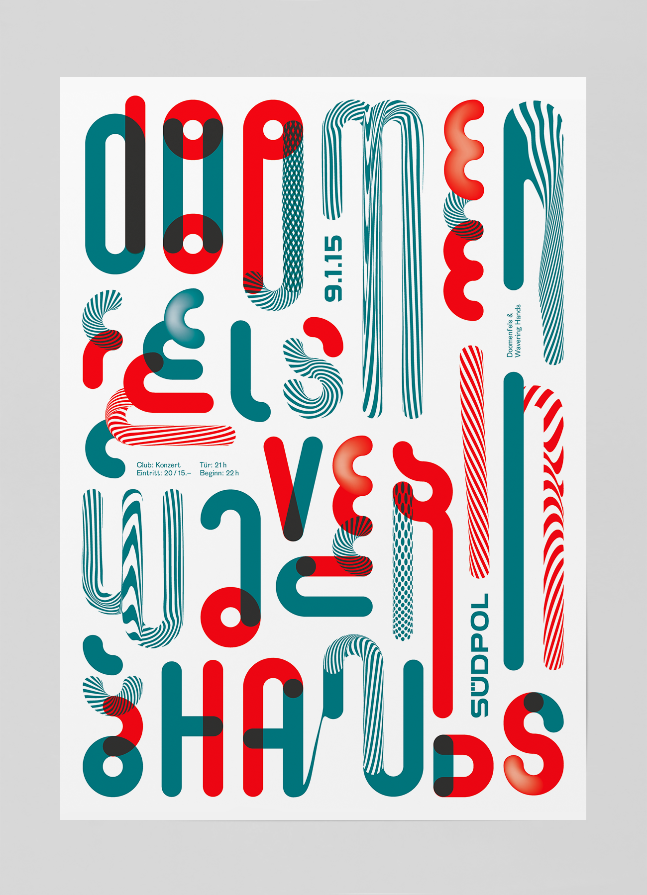
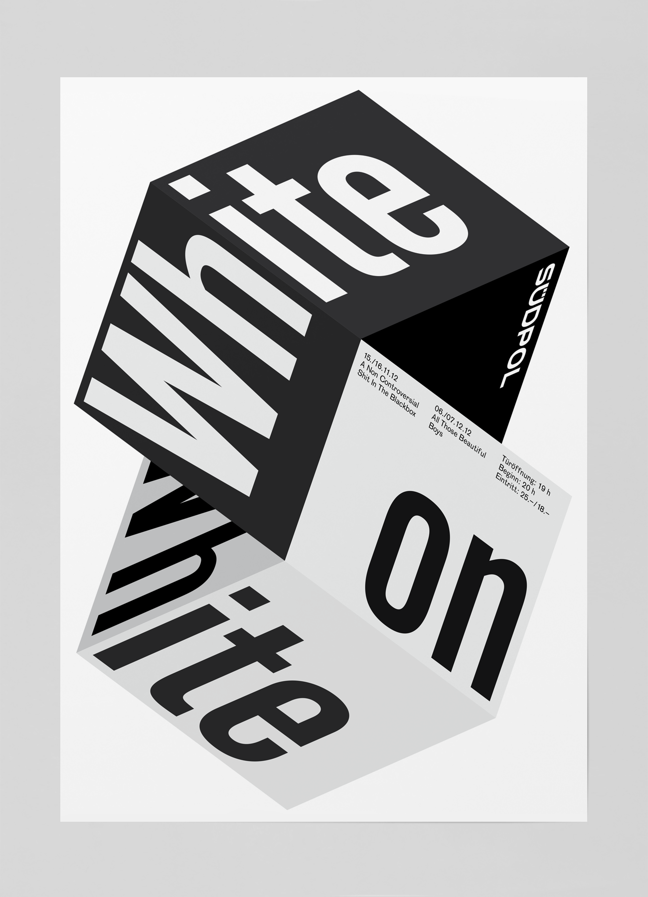
For this mini blurb I wanted to focus on Felix Pfäffli’s posters for Sudpol, a multi-purpose cultural center in Kriens, Switzerland. From 2010 to 2015, Felix designed ALL the posters for Sudpol's events, and the results are indicative of the amazing things that happen when a client fully trusts a designer to go crazy. Bending form and legibility, these posters are nothing short of gorgeous.

I'm gonna stop typing and just highlight these things because HOLY SHIT, look at em!

All images copyright StudioFeixen.ch

And that's not even close to all of them. Anyway, I hope you dig the brilliance of Felix Pfäffli as much as I did. Studio Feixen also did one of my favorite projects of all time. Europeans are SMART!
New Hotness: USS Callister by Zan Barnett

Been slacking for sure on writing, but I have been making some cool new things. 

Here's a poster inspired by my new favorite show; Black Mirror. Awesome. Perhaps I'll print these at some point.

ZanBarnett_SpaceFleet-Callister2.jpg

2018: Write more, make more stuff, get my finances in order. Strong goals!

180105_SpaceFleet.jpg

The Story of the Assam Tourism Logo by Zan Barnett

HigherEd-Assam-0.jpg

This article could also be called, "The Pitch of the Century".

I learned about this story while looking at one of my favorite websites Brand New. While cruising around I saw a RIDICULOUS brand update for Assam Tourism.

Part One

Assam is a state in northeastern India known for its wildlife, archeological sites and tea plantations. In the west, Guwahati, Assam’s largest city, features silk bazaars and the hilltop Kamakhya Temple. It's also full of Indian one-horned rhinoceroses (what an insane word, don't think I've ever typed that before).

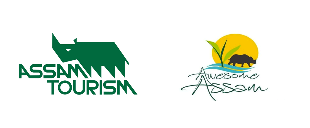
This story is interesting for one reason, and hilarious for another reason. Let's talk about the interesting part first. Check out before and after the logo redesign below:

Image Credit: Brand New

Image Credit: Brand New

Gnarly huh? And not in a good way. It’s a shame because the original Assam Tourism logo (on the left)  is pretty badass and it’s sad to see it go for something shall-we-say, ‘high-school kid who just downloaded Illustrator’. While the previous mark is not necessarily in line with 2017 trends, it had that awesome late-70’s sorta-corporate-bold energy about it and interesting custom, bauhaus-and-NASA-had-a-baby typography that complemented the mark and created a truly memorable logo.

Baruah's logo is seen all over Assam

Baruah's logo is seen all over Assam

The story gets really interesting when you learn that it was created in 1978 by Amulya Baruah, a student at the Sir J. J. Institute of Applied Art in Mumbai. The logo was created as part of a project to create an advertising campaign for any organization. This interview goes into a lot of detail about the story and Amulya's thoughts on the rebrand, but the short story is that the Assam Tourism commission liked the designs so much that they bought them on the spot and the mark has been in effect for the last 30 or so years up until this September (longevity being a pretty good indication of the strength of a mark). Amulya Baruah has owned his own agency (ignore the horrible-resolution logo) focusing on packaging for last three decades. It's unfortunate the Assam Tourism commission didn't see the golden opportunity in having the same designer update his own work (he is also responsible for this beauty). It would have made for a much better story, instead we get this...

HigherEd-Assam4.jpg

Some glowing-99designs-pick-a-free-font-and-add-four-too-many-elements lookin' ass thing. I wont pile on too much into the details, as other sites have covered the elements of the weak design and subsequent disappointment.

Part Two

BUT. That leads me to the best part of this whole story (or why I should have called this 'The Pitch of the Century'). In doing some research into the logo process and launch, I discovered the official logo launch PR document and boy is it EPIC. I don't know who wrote this, but the spin-zone is absolutely unparalleled. Here we go:

The logo constitutes four essential elements that exemplify Assam- rhinoceros representing wondrous wildlife, emerald-green tea leaf, the wave of mighty Brahmaputra and scenic beauty ever-shining like the sun. When put together in a harmonious blend, it tells the story of Awesome Assam.

Most designers would agree that four elements might be two or three too many for a 'harmonious blend' but let's go with it..

The logo depicts Assam as a delightful abode for the senses. All the four elements of the logo are unbound, thus signifying serenity and soothing solitudes as far as one can see or feel. The overall look of the logo appears as natural and unblemished, as something that‟s been preserved here for a very long time, away from the hustle-bustle of modernity and pollution.

I'm definitely feeling serene, soothing, solitudes. This description is truly a delight for the senses...

The logo is aesthetically rich as it projects so many untold awesome stories attached to it. So much so that it might strike you with the thought, “let‟s go to awesome Assam.”

DONE. Book the fuckin' flight!