

This article could also be called, "The Pitch of the Century".
I learned about this story while looking at one of my favorite websites Brand New. While cruising around I saw a RIDICULOUS brand update for Assam Tourism.
Part One
Assam is a state in northeastern India known for its wildlife, archeological sites and tea plantations. In the west, Guwahati, Assam’s largest city, features silk bazaars and the hilltop Kamakhya Temple. It's also full of Indian one-horned rhinoceroses (what an insane word, don't think I've ever typed that before).
This story is interesting for one reason, and hilarious for another reason. Let's talk about the interesting part first. Check out before and after the logo redesign below:
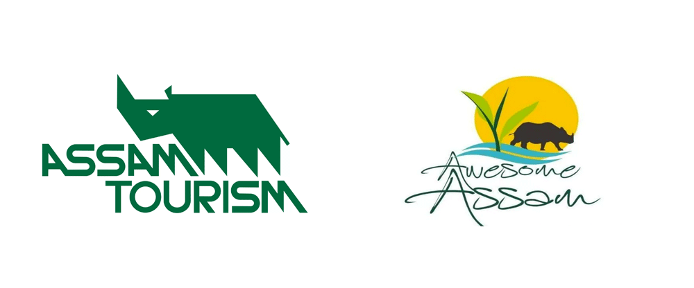
Image Credit: Brand New
Gnarly huh? And not in a good way. It’s a shame because the original Assam Tourism logo (on the left) is pretty badass and it’s sad to see it go for something shall-we-say, ‘high-school kid who just downloaded Illustrator’. While the previous mark is not necessarily in line with 2017 trends, it had that awesome late-70’s sorta-corporate-bold energy about it and interesting custom, bauhaus-and-NASA-had-a-baby typography that complemented the mark and created a truly memorable logo.
Baruah's logo is seen all over Assam
The story gets really interesting when you learn that it was created in 1978 by Amulya Baruah, a student at the Sir J. J. Institute of Applied Art in Mumbai. The logo was created as part of a project to create an advertising campaign for any organization. This interview goes into a lot of detail about the story and Amulya's thoughts on the rebrand, but the short story is that the Assam Tourism commission liked the designs so much that they bought them on the spot and the mark has been in effect for the last 30 or so years up until this September (longevity being a pretty good indication of the strength of a mark). Amulya Baruah has owned his own agency (ignore the horrible-resolution logo) focusing on packaging for last three decades. It's unfortunate the Assam Tourism commission didn't see the golden opportunity in having the same designer update his own work (he is also responsible for this beauty). It would have made for a much better story, instead we get this...

Some glowing-99designs-pick-a-free-font-and-add-four-too-many-elements lookin' ass thing. I wont pile on too much into the details, as other sites have covered the elements of the weak design and subsequent disappointment.
Part Two
BUT. That leads me to the best part of this whole story (or why I should have called this 'The Pitch of the Century'). In doing some research into the logo process and launch, I discovered the official logo launch PR document and boy is it EPIC. I don't know who wrote this, but the spin-zone is absolutely unparalleled. Here we go:
The logo constitutes four essential elements that exemplify Assam- rhinoceros representing wondrous wildlife, emerald-green tea leaf, the wave of mighty Brahmaputra and scenic beauty ever-shining like the sun. When put together in a harmonious blend, it tells the story of Awesome Assam.
Most designers would agree that four elements might be two or three too many for a 'harmonious blend' but let's go with it..
The logo depicts Assam as a delightful abode for the senses. All the four elements of the logo are unbound, thus signifying serenity and soothing solitudes as far as one can see or feel. The overall look of the logo appears as natural and unblemished, as something that‟s been preserved here for a very long time, away from the hustle-bustle of modernity and pollution.
I'm definitely feeling serene, soothing, solitudes. This description is truly a delight for the senses...
The logo is aesthetically rich as it projects so many untold awesome stories attached to it. So much so that it might strike you with the thought, “let‟s go to awesome Assam.”
DONE. Book the fuckin' flight!